Not Found
Not Found
Not Found
Not Found
Not Found
Not Found
Not Found
Not Found
Not Found
Not Found
Not Found
Not Found
Not Found
Not Found
Not Found
Not Found
Not Found
Not Found
Not Found
Not Found

Submitted

Responsive QR code component using Bootstrap

@richie-omondi

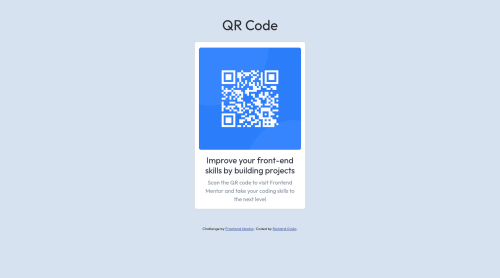
Desktop design screenshot for the QR code component coding challenge

This is a solution for...

  • HTML
  • CSS
1newbie
View challenge

Design comparison


SolutionDesign

Solution retrospective


As much as I enjoyed working on this project, I still have a few challenges in implementing Bootstrap.

  • First of all, is there any way I could improve my use of sematic HTML to improve code readability and accessibility? I decided to use the <section> and <footer> tags to demarcate the different sections of the page.
  • How can I make the edges of the card and image more rounded?
  • How can I make the card longer?
  • Is the responsiveness good enough or how could I improve on it?

Thank you!

Community feedback

@0xabdulkhaliq

Posted

Hello there 👋. Congratulations on successfully completing the challenge! 🎉

  • I have other recommendations regarding your code that I believe will be of great interest to you.

HTML 🏷️:

  • This solution generates accessibility error reports due to incorrect usage of semantic markup, which confuses the landmark of this webpage
  • So fix it by replacing the <section class="section my-5"> with semantic element <main> in your index.html file to improve accessibility and organization of your page.
  • What is meant by landmark ?, They used to define major sections of your page instead of relying on generic elements like <div> or <span>
  • They convey the structure of your page. For example, the <main> element should include all content directly related to the page's main idea, so there should only be one per page

HEADINGS ⚠️:

  • And, This solution had also generated another accessibility error report due to skipping heading levels
  • We want to avoid skipping heading levels, make sure to start with <h1> and working your way down the heading levels (<h2>, <h3>, etc.) helps ensure that our document has a clear and consistent hierarchy. Read more 📚
  • Because skipping heading levels is a poor practice from the perspective of information design, whether we are talking about web pages, books, journal articles, or about anything else. You can not only confuse screen readers but all readers when you don't follow a consistent, logical pattern with your heading structure.

I hope you find this helpful 😄 Above all, the solution you submitted is great !

Happy coding!

Marked as helpful

1
Syed Umair 180

@SYEDUMAIR007

Posted

Hey friend, Its Syed Umair, first of all I would like to congratulate you for the completion of your project. You can remove the warnings in the validation report by following these steps:

  1. U cant have directly h4 after h1 so use h2 because u always have to come in hierarchy.
  2. Always u should have a main section in your project, so nest the code which is in body tag into main tag and then keep main inside body.
  3. And for having more rounded corners give the div an id and select that div inside css style sheet and give it a border radius of 1.875 rem.

Hope you like my suggestions helpful.

Marked as helpful

1
P
Cuong Ly 180

@cuonglyy

Posted

Hello Richard!

Great job on finishing this challenge! Here are some things I can recommend for you:

  • Here's a link to obtain the rounded edges in Bootstrap: Bootstrap border-radius

  • You can use <main> element to define the main content of your document.

  • <div class="attribution"> doesn't have to be wrapped around a <footer> element, you can change <div class="attribution"> to <footer class="attribution">

Hope this helps! Happy coding (-:

Marked as helpful

1

Please log in to post a comment

Log in with GitHub
Discord logo

Join our Discord community

Join thousands of Frontend Mentor community members taking the challenges, sharing resources, helping each other, and chatting about all things front-end!

Join our Discord