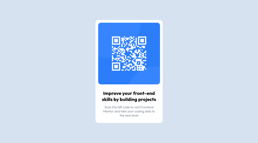
Design comparison
Community feedback
- @correlucasPosted about 2 years ago
👾Hello , congratulations on your first solution!
Nice code and nice solution! You did a good job here putting everything together. I’ve some suggestions for you:
1.The main heading has the tag
<h2>, in this case, you should replace it with<h1>since this heading is the main title on this page. Remember that every page should have one<h1>to declare which is the most important title and that you should follow the hierarchy using the heading sequence(h1, h2, h3, h4, h5)and never jump a level.2.Use
<main>instead of a simple<div>this way you improve the semantics and accessibility showing which is the main block of content on this page. Remember that every page should have a<main>block and that<div>doesn't have any semantic meaning.3.Clean your code by removing some unnecessary divs, most of the content can stand alone without a div. Use div only for blocks that need a special alignment or the content needs a special positioning.
4.Add the correct size to avoid the container growing more than it should. In this case the QR CODE component size is
max-width: 320px.5.Add the box shadow to stylize the card:
box-shadow: 5px 5px 15px 5px rgb(0 0 0 / 3%);✌️ I hope this helps you and happy coding!
0
Please log in to post a comment
Log in with GitHubJoin our Discord community
Join thousands of Frontend Mentor community members taking the challenges, sharing resources, helping each other, and chatting about all things front-end!
Join our Discord
