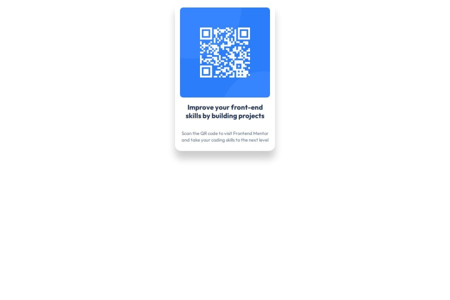


Design comparison

Community feedback
- P@Islandstone89Posted 4 months ago
HTML:
-
Every webpage needs a
<main>that wraps all of the content, except for<header>andfooter>. This is vital for accessibility, as it helps screen readers identify a page's "main" content. Wrap the card in a<main>. -
The alt text must also say where it leads(the frontendmentor website). A good alt text would be "QR code leading to the Frontend Mentor website."
CSS:
-
Including a CSS Reset at the top is good practice.
-
box-sizing: border-boxshould be set on all elements with the universal selector*:
*, *::before, *::after { box-sizing: border-box; }-
Use the style guide to find the correct
background-color, which should be set on thebody. -
I recommend adding a bit of
padding, for example16px, on thebody, to ensure the card doesn't touch the edges on small screens. -
The
bodyis by default only as tall as its content, meaning there is no vertical space to center the card in. To fix this, addmin-height: 100svhon thebody- this makes it take up at least the full viewport height, while having room to grow (usingheightwould prevent the body from growing if needed). -
Remove all instances of
width,max-width,heightandmax-height. -
Add a
max-widthof around20remon the card, to prevent it from getting too wide on larger screens. -
Remove
display: flexon.text, it is not needed. -
font-sizemust never be in px. This is a big accessibility issue, as it prevents the font size from scaling with the user's default setting in the browser. Use rem instead. -
Since all of the text should be centered, you only need to set
text-align: centeron the body, and remove it elsewhere. The children will inherit the value. -
For the same reason, set
font-familyon thebodyand remove it elsewhere - its children will inherit the value. -
On the image, add
display: block,height: autoandmax-width: 100%- the max-width prevents it from overflowing its container. Without this, an image would overflow if its intrinsic size is wider than the container.max-width: 100%makes the image shrink to fit inside its container.
0 -
- @teeogcodePosted 4 months ago
Well, the card is at the top and not in the center. I personally cannot claim to be an expert on resolving this issue.
I usually just have a container's width and height set as a percentage of its parent element and then use the margin: auto; property-value pair.
I also just play around with align-items, justify-content, place-content and place-self until I get the container in the center😅
0


Please log in to post a comment
Log in with GitHub
Join our Discord community
Join thousands of Frontend Mentor community members taking the challenges, sharing resources, helping each other, and chatting about all things front-end!
Join our Discord