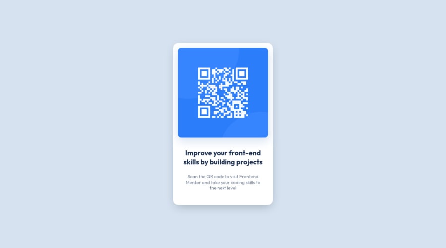
Design comparison
Solution retrospective
Though I was able to achieve the desired result, I'm not sure if I am following the best practices. Any help, criticism or feedback is welcome, I am here to learn!
Community feedback
- @correlucasPosted over 2 years ago
👾Hi @damagermax, congratulations on your solution!👋 Welcome to the Frontend Mentor Coding Community!
Great solution and a great start! From what I saw you’re on the right track. I’ve few suggestions for you that you can consider adding to your code:
- Your solution is great and the code is working, but the HTML structure can be reduced by removing unnecessary divs, all you need is a single
<main>or<div>to keep all the content inside, and nothing more. The ideal structure is thedivand only the image, heading, and paragraph.
Here’s one example to show can be cleaner this HTML structure:
<body> <main> <img src="./images/image-qr-code.png" alt="QR Code Frontend Mentor" > <h1>Improve your front-end skills by building projects</h1> <p>Scan the QR code to visit Frontend Mentor and take your coding skills to the next level</p> </main> </body>- Replace the
<h2>containing the main title with<h1>note that this title is the main heading for this page and every page needs one h1 to show which is the most important heading. Use the sequence h1 h2 h3 h4 h5 to show the hierarchy of your titles in the level of importance, never jump a level. - Add a margin of around
margin: 20pxto avoid the card touching the screen edges while it scales down.
Here's my solution for this challenge if you wants to see how I build it: https://www.frontendmentor.io/solutions/qr-code-component-vanilla-cs-js-darklight-mode-nS2aOYYsJR
✌️ I hope this helps you and happy coding!
Marked as helpful0@damagermaxPosted over 2 years ago@correlucas Thank you for the feedback. I will work on it.
0 - Your solution is great and the code is working, but the HTML structure can be reduced by removing unnecessary divs, all you need is a single
- @PhoenixDev22Posted over 2 years ago
Hi Maxwell Takyi,
Congratulation on completing another frontend mentor challenge.
Excellent work! I have some suggestions regarding your solution:
- Page should contain
<h1>. The<h1>is most commonly used to mark up a web page title. This challenge is supposed to be one component of a web page. To tackle the accessibility issues in the report , you may use an<h1>visually hidden withclass=”sr-only”.You can find it here.
- In my opinion, the alternate text should indicate where the Qr code navigate the user : like
QR code to frontendmentor.io.
Hopefully this feedback helps.
Marked as helpful0@damagermaxPosted over 2 years ago@PhoenixDev22 Thank you for the feedback. I will work on it.
0 - Page should contain
Please log in to post a comment
Log in with GitHubJoin our Discord community
Join thousands of Frontend Mentor community members taking the challenges, sharing resources, helping each other, and chatting about all things front-end!
Join our Discord
