

Design comparison

Solution retrospective
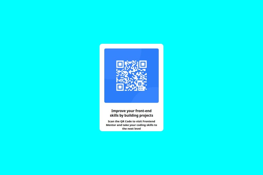
I am most proud of successfully building a responsive QR code component using only HTML and CSS. This was my first challenge on Frontend Mentor, and I learned how to use Flexbox, margin, and padding effectively to align elements properly.
Next time, I would focus more on improving the design by experimenting with shadows, colors, and spacing to make the card look more polished. I would also like to use CSS Grid and try adding some simple animations for a better user experience.
What challenges did you encounter, and how did you overcome them?Not too much challenges faced but i was stuck in text-align. So i asked it in our discord community and there i find solution of my challenge.
What specific areas of your project would you like help with?I would like feedback on the design and responsiveness of my project. Specifically:
Visual Styling – Are there any improvements I can make to enhance the overall look and feel of the card?
Responsiveness – Does the layout work well on all screen sizes, or are there any issues I should fix?
Code Optimization – Are there any unnecessary styles or better ways to structure my CSS?
Community feedback
Please log in to post a comment
Log in with GitHubJoin our Discord community
Join thousands of Frontend Mentor community members taking the challenges, sharing resources, helping each other, and chatting about all things front-end!
Join our Discord