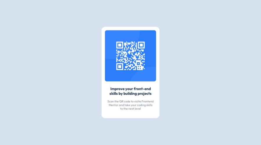
Design comparison
Solution retrospective
This project allows me to practice using new units such as em and rem, learn how to center elements, and create a well-structured HTML layout.
What challenges did you encounter, and how did you overcome them?I struggled to center my component. I looked for differents solutions on MDN web doc such as using flexblox or margin.
What specific areas of your project would you like help with?Every advice or note about my project is welcome to improve my code
Community feedback
- @DanijelAdrinekPosted 8 months ago
you forgot to add the box-shadow to the design, and your design website doesnt match the design, when you work as a web dev, you will need to size down your browser, take a screenshot of your website, compare it to design, and make sure it matches, its how its done, I prefer to do it using ctrl + shift + s, and just paste-ing it in figma, you can also check the distance from one component in figma to the other by holding alt, and selecting one of the components, font-size should be the same as on the design, and css has a really helpful tool, the css variables that I recommend you learn, because on bigger projects, they are a life saver!
Overall still one of the better projects I've seen :)
if you want, you can also take my project as an example: https://www.frontendmentor.io/solutions/just-css-and-html-its-too-small-of-a-project-to-need-ro-add-anything-9zhphjxoE5
I hope this helps, and if you have any further questions or need help, feel free to ask my dude :D
Marked as helpful1@Sayf3rPosted 8 months ago@DanijelAdrinek thanks for your feedback it's very helpful. I didn't notice the box shadow :D . Your project looks very clean ! I'll look your code to see what I can improve
1 - @Harsh-Kumar-DwivediPosted 8 months ago
Hi @Sayf3r ,
I think you can prefer to replace
<div class="main-container">
with<main>
element and<p>Improve your front-end skills by building projects</p>
with<h1>Improve your front-end skills by building projects</h1>
element. These will improve accessibility and make your markup more semantic.Hope it is helpful !
Stay Happy & Well !
Happy Coding !
Marked as helpful0
Please log in to post a comment
Log in with GitHubJoin our Discord community
Join thousands of Frontend Mentor community members taking the challenges, sharing resources, helping each other, and chatting about all things front-end!
Join our Discord