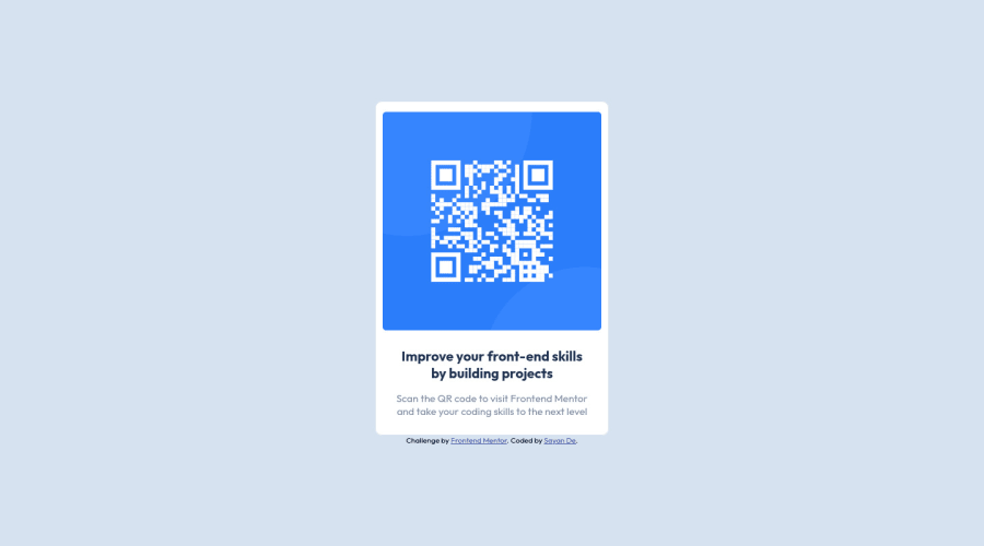
Design comparison
Solution retrospective
At 4K, the component becomes quite small, would be a great help if you could recommend how to fix it.
Community feedback
- @NaveenGumastePosted almost 3 years ago
Hay ! Sayan De Good Job on challenge
These below mentioned tricks will help you remove any Accessibility Issues
-> Add Main tag after body
<main class="container"></main>-> Learn more on accessibility issues
If this comment helps you then pls mark it as helpful!
Have a good day and keep coding 👍!
Marked as helpful1 - Account deleted
Hello there! 👋
Congratulations on finishing your challenge! 🎉
I have some feedback on this solution:
-
its very small on 4k because the font width padding etc is small so increase all of them and they would fit the 4k but imo you don't have to do it
-
Always Use Semantic HTML instead of
divlike<main><header>, etc for more info.
if my solution has helped you do not forget to mark this as helpful!
Marked as helpful1@RoosterRooPosted almost 3 years ago@Old1337 thanks for the comment. I will be sure to incorporate those. About Semantic HTML, it's a relatively small project so I decided not to use those and go with the div but in future iterations I will change them as well.
1 -
- @GitHub-dev12345Posted almost 3 years ago
used this code to improve your design:
In Your Card Design CSS Code Used this Property:
margin : 20px; border-radius: 13px;
improve your design & Good Work Keep it up ❤️👍
0
Please log in to post a comment
Log in with GitHubJoin our Discord community
Join thousands of Frontend Mentor community members taking the challenges, sharing resources, helping each other, and chatting about all things front-end!
Join our Discord
