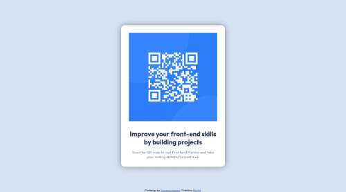
Design comparison
Solution retrospective
Well, ig it's good, but i know i always have how to improve or something that's wrong with my code, so constructive criticism are welcome
Community feedback
- @vanzasetiaPosted over 2 years ago
Hi, Enderzin! 👋
Good effort on this challenge! 👍
I notice that there's a
!important
in your stylesheet which I recommend trying to remove by moving the media query below thecontainer
styling. Remember, you can nest the@media
query since you are using Sass.The only thing that the card needs to be responsive is only a
max-width
with eitherpx
orrem
(recommended). So, there's no need for media queries.img
tag should alwaysalt
attribute. The QR code image is the most important content of the site so I suggest adding an alternative text. Alternative text like "QR code for frontendmentor.io" would be a great alternative text because it tells the user what is the image and what is used for.I strongly recommend making the
body
element as a flex container to make the card easily in the middle of the page. This way, thecontainer
doesn't need any absolute positioning.That's it! Hope this helps.
Marked as helpful0
Please log in to post a comment
Log in with GitHubJoin our Discord community
Join thousands of Frontend Mentor community members taking the challenges, sharing resources, helping each other, and chatting about all things front-end!
Join our Discord