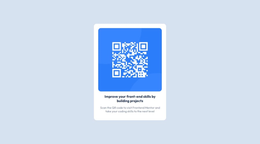
Design comparison
SolutionDesign
Solution retrospective
What are you most proud of, and what would you do differently next time?
It was minimal HTML, and very little CSS so the skeleton went pretty okay.
What challenges did you encounter, and how did you overcome them?It should have taken a shorter time than it did, but every time I use flexbox I learn a bit more.
What specific areas of your project would you like help with?I am glad I was easily able to center the content, though I feel I have way too much margin.
Community feedback
Please log in to post a comment
Log in with GitHubJoin our Discord community
Join thousands of Frontend Mentor community members taking the challenges, sharing resources, helping each other, and chatting about all things front-end!
Join our Discord
