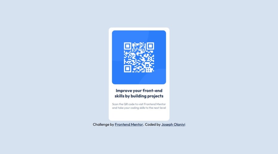
Design comparison
Solution retrospective
All feedback is welcome, thank you in advance
What challenges did you encounter, and how did you overcome them?I think the only problem I faced was centering the card div, it took me a while but after some research, I was able to center it by changing the parent div to flexbox and adding the justify content and align content.
What specific areas of your project would you like help with?I'm struggling a bit with media queries and could use some guidance.
Community feedback
- @AtanasovCodePosted 8 months ago
Hey, great solution. Some tips I would like to give you are centered around responsive design.
Right now the width and height of the card are fixed which is bad practice when it comes to making sites responsive. So instead of proving a fixed height to your card, you should let the content inside determine it's height.
So instead of doing this:
 width: 315px;
 max-width: 315px;
 height: 484px;
You can instead use padding inside of the card, and apply margin and padding the the children elements inside of the card and this will make the height dynamic and based on the content inside.
You said you struggled a bit with media queries but they are also very important when it comes to responsive design. You can think of them as breakpoints that get applied whenever a certain width is reached.
For example you could add this bit of code to your solution that will make the card take up 90% of the screen width if the width of the screen is less than 648px:
@media (max-width: 648px) {
    width: 90%;
    max-width: 90%;
}
Good luck and happy learning :)
0@joelaniPosted 8 months ago@AtanasovCode thank you so much , you just enlightened me on the fixed width and height cus i never knew i was doing something wrong
0
Please log in to post a comment
Log in with GitHubJoin our Discord community
Join thousands of Frontend Mentor community members taking the challenges, sharing resources, helping each other, and chatting about all things front-end!
Join our Discord
