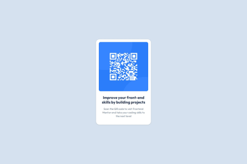
Submitted over 1 year agoA solution to the QR code component challenge
Responsive QR code component
bem

@edpau
Solution retrospective
What challenges did you encounter, and how did you overcome them?
Flexbox- gap vs Margin
Problem:
- I tried to match the card height in the Figma file, I started with with
margin-bottom: 24pxon the image to create the gap between image and the text box. - Noticed extra vertical space added when using
margin-bottom, even though the developer tools showed a 24px margin.
Solution:
- Replaced
gap: 24pxin the.cardflex container withmargin-bottom: 24pxon the image.
Please advise any better and easy way to match the Figma design card height.
What specific areas of your project would you like help with?I tried to match the design of the card description, I want the last line of text to show "the next level" instead of "next level" , just like the Figma design, so I put a width 256px in the p tag, it forces the "the" to go to the last line.
Please advise is there any better way to achieve the same result. Thx
Code
Loading...
Please log in to post a comment
Log in with GitHubCommunity feedback
No feedback yet. Be the first to give feedback on edpau's solution.
Join our Discord community
Join thousands of Frontend Mentor community members taking the challenges, sharing resources, helping each other, and chatting about all things front-end!
Join our Discord