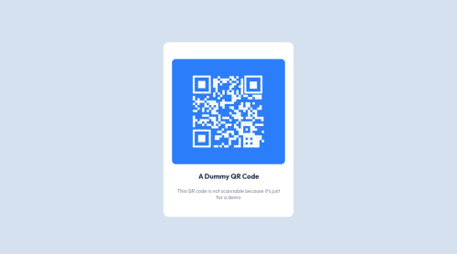
Submitted over 1 year agoA solution to the QR code component challenge
Responsive QR code component
@sivaprasadev

Solution retrospective
What are you most proud of, and what would you do differently next time?
I am proud of myself for just completing a responsive component using HTML and CSS. I will build few more projects to get a proper grip on responsive web development.
What challenges did you encounter, and how did you overcome them?I was struggling to get mobile responsiveness. With the help of Google, I understood some points and applied them.
What specific areas of your project would you like help with?I still need help with making the site responsive. I need help with media queries and other layout implementations using Flex and Grid. Moreover, I would like to know what are the units we should use to get a proper responsive pages.
Code
Loading...
Please log in to post a comment
Log in with GitHubCommunity feedback
No feedback yet. Be the first to give feedback on Think Like a Techy's solution.
Join our Discord community
Join thousands of Frontend Mentor community members taking the challenges, sharing resources, helping each other, and chatting about all things front-end!
Join our Discord