Not Found
Not Found
Not Found
Not Found
Not Found
Not Found
Not Found
Not Found
Not Found
Not Found
Not Found
Not Found
Not Found
Not Found
Not Found
Not Found
Not Found
Not Found
Not Found
Not Found

Submitted

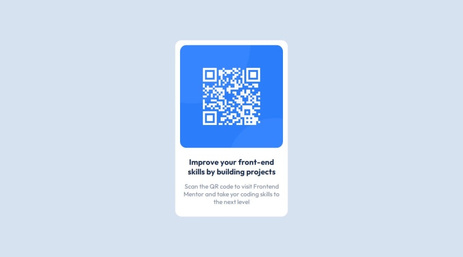
Responsive QR Code Component Design Challenge Page Solution

Desktop design screenshot for the QR code component coding challenge

This is a solution for...

  • HTML
  • CSS
1newbie
View challenge

Design comparison


SolutionDesign

Solution retrospective


What are you most proud of, and what would you do differently next time?

I'm honing my HTML and CSS knowledges and or skills using this basic project. I have learned about css flexbox and Sass (tool).

Sass is really useful tool to make easy my workflow as a Junior Front-End Developer.

What challenges did you encounter, and how did you overcome them?

I encountered a problem about positioning "div.container" to center a page and fitting size of "div.container > div.item1 > img" image into container size. I'm trying all of my best to tackle this problem by searching google.

What specific areas of your project would you like help with?

HTML, CSS, Sass, and Web Design.

Community feedback

P

@IncorrigibleSpirit

Posted

Hi, mate!

Initially, I would like to congratulate you on starting your front-end path and uploading your projects on the platform.

Concerning the challenges that you had to face (centering the main element on the page and fitting the picture size), I resolved them using other alternatives. I hope they will help you.

How to center an element? A good trick that never fails is using display: flex along with justify-content and align-items centered.

.main-container {
  display: flex;
  flex-direction: column;
  justify-content: center;
  align-items: center;
  min-width: 20rem;
  max-width: 87.5rem;
  width: 100%;
  min-height: 100vh;
}

Concerning the image, a trick that helps me to control its size is to create a <div> that wraps the image. On it, you can apply flexible length units or relative units. The idea is to avoid fixed sizes to achieve better responsiveness in your design. Here is a good resource: A Practical Guide to Responsive Web Design. LINK

.image-container {
  display: flex;
  justify-content: center;
  align-items: center;
  max-width: 18rem;
  max-height: 18rem;
}

.image-container img {
  max-width: 100%;
  border-radius: 5%;
}

I hope my comments can help you. I am also starting on this path. See you!

0

Please log in to post a comment

Log in with GitHub
Discord logo

Join our Discord community

Join thousands of Frontend Mentor community members taking the challenges, sharing resources, helping each other, and chatting about all things front-end!

Join our Discord