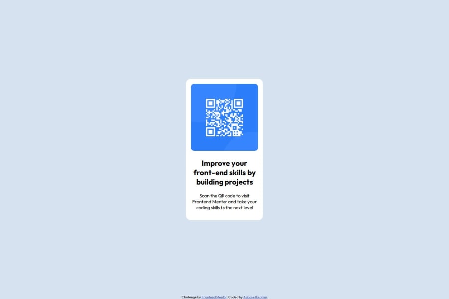


Design comparison

Solution retrospective
i designed it using a mobile first approach. in my next project, i will like to experiment with CSS Grid instead of flexbox for centering and layout control to compare the flexibility and simplicity of each approach.
What challenges did you encounter, and how did you overcome them?Initially, I struggled to vertically center the .main-container for larger screens. i thought using margin: auto; will automatically center vertically as well but later found out thatit has to have a defined parent height.
Solution: I switched to using Flexbox on the body with align-items: center and justify-content: center, which solved the issue.
i also had issue with knowing the size to use for an average size mobile
What specific areas of your project would you like help with?Are there better ways to ensure the design remains consistent on even larger screens because i noticed that the design seems a bit off for some screen size
Could I improve how i’ve used media queries to handle responsiveness more efficiently?
Am I following best practices for accessibility? For example, is the alt text in my <img> tag descriptive enough? and are there other things i could add to make the page more accessible
Community feedback
- @tortarugaPosted 3 months ago
hi! i think the reason it looks weird on bigger screens is because on screens larger than 768px the width of .main-component is set to 15%, which is a bit small. you can try playing around with other percentage values, or even setting a fixed value like 320px, until you are satisfied with the way it looks. the rest is looking good, keep it up!
0

Please log in to post a comment
Log in with GitHub
Join our Discord community
Join thousands of Frontend Mentor community members taking the challenges, sharing resources, helping each other, and chatting about all things front-end!
Join our Discord