

Design comparison

Solution retrospective
Hello friends! I have just completed the newbie QR component challenge. Please review my solution and give me any comment and suggestion.
- I didn't see the responsiveness difference on the mobile and desktop rather than the top margin.
- What are the Mobile 375px width and Desktop 1440px width for? did I do it in a right way?
Community feedback
- @MelvinAguilarPosted about 2 years ago
Hello there 👋. Good job on completing the challenge !
I have other suggestions about your code that might interest you.
- Those values are to know in which dimensions the images that come from preview are, you don't necessarily have to create a media query for those dimensions, you can create it when you consider it correct, also there is no difference between mobile and desktop so it's better not to use a media query, with flexbox it would already be centered.
HTML 🏷️:
- Always avoid skipping heading levels; Starting with <h1> and working your way down the heading levels (<h2>, <h3>, etc.) helps ensure that your document has a clear and consistent hierarchy. Source 📘
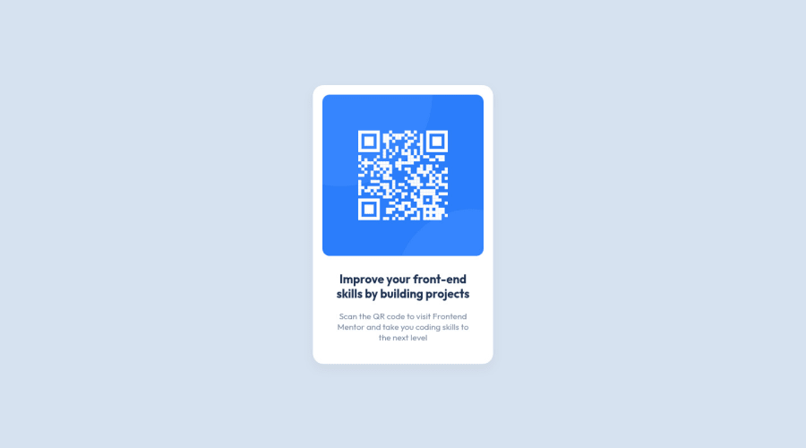
- Since this component involves scanning the QR code, the image is not a decoration, so it must have an
altattribute. Thealtattribute should explain its purpose. e.g.QR code to frontendmentor.io
I hope you find it useful! 😄 Above all, the solution you submitted is great!
Happy coding!
Marked as helpful1 - @grace-snowPosted about 2 years ago
All the above feedback is great so I will try not to repeat. But you do have some other important things to learn here
-
You don't need any divs on this at all. Don't add extra html when it's not needed. Your container can be the main element, and neither the image or text need wrapping in divs
-
The image on this is the most important content on the page, but you have left it's alt blank, therefore treating it as a decorative image. It's really really important to write a proper alt description of what this image is and where it goes (as it's a scannable image in this case)
-
Never ever write font size in px. Extremely important. Use rem. Many users need to change their font size settings but these would not be honoured if you have forced font size in px
-
When writing media queries in future use rem or em, not px. You will also always set them larger than this. You will want to set them to start at the point where there is room for the layout to change. This challenge doesn't need any media query at all - this is just a learning point for future challenges
Marked as helpful0 -
- @MariaDoesCodingPosted about 2 years ago
Congrats!
I do think that the mobile and desktop measurements are for the images or maybe it means that the site would work best on those types of mobiles and desktops.
Also for the responsiveness question, I have the same problem too! still looking for answers but great job on what you did!
The site doesn't have to be a perfect match to the original.
Marked as helpful0 - @HassiaiPosted about 2 years ago
Replace <div class="container card"> with the main tag and <h3> with <h1> to fix the accessibility issues. click here for more on web-accessibility and semantic html
To center .container on the page using flexbox or grid instead of margin, add min-height:100vh; display: flex; align-items: center: justify-content: center; or min-height:100vh; display: grid place-items: center to the body.
To center .container on the page using flexbox:
body{
min-height: 100vh;
display: flex;
align-items: center;
justify-content: center;
}
To center .container on the page using grid: body{ min-height: 100vh; display: grid; place-items: center; }Give .desc-container a margin value for all the sides, text-align: center and a font-size of 15px which is 0.9375rem, this will be the font-size of both p and h1. Give p a margin-top or h1 a margin-bottom value for the space between the text.
i will advice you use BEM for the multiple class naming of an element.
Use relative units like rem or em as unit for the padding, margin, width values and preferably rem for the font-size values, instead of using px which is an absolute unit. For more on CSS units Click here
Hope am helpful.
Well done for completing this challenge. HAPPY CODING
0


Please log in to post a comment
Log in with GitHub
Join our Discord community
Join thousands of Frontend Mentor community members taking the challenges, sharing resources, helping each other, and chatting about all things front-end!
Join our Discord