Design comparison
Solution retrospective
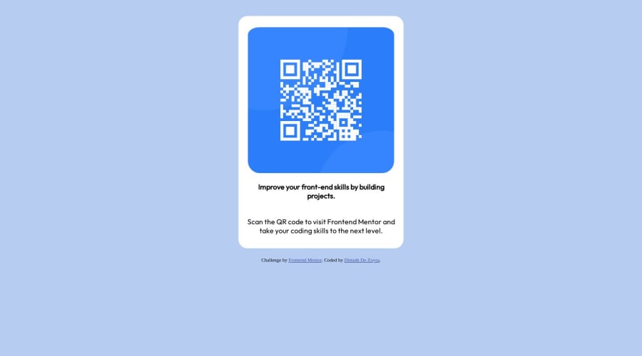
While building this project, I encountered a few challenges. One of the difficulties I faced was ensuring the proper alignment and centering of the content. I had to use CSS flexbox properties and adjust margins and paddings to achieve the desired layout. I would appreciate feedback on the overall visual presentation and any suggestions for improving the centering of the elements.
In terms of the code, I would particularly like feedback on the usage of the "Outfit" font. I have added the font using the Google Fonts service, but I'm unsure if this is the most efficient and recommended way to include custom fonts. Any advice or best practices in this regard would be greatly appreciated.
Furthermore, I am open to feedback on the code structure and organization. If there are any areas where the code can be optimized or improved for better maintainability, please feel free to provide suggestions.
Community feedback
Please log in to post a comment
Log in with GitHubJoin our Discord community
Join thousands of Frontend Mentor community members taking the challenges, sharing resources, helping each other, and chatting about all things front-end!
Join our Discord
