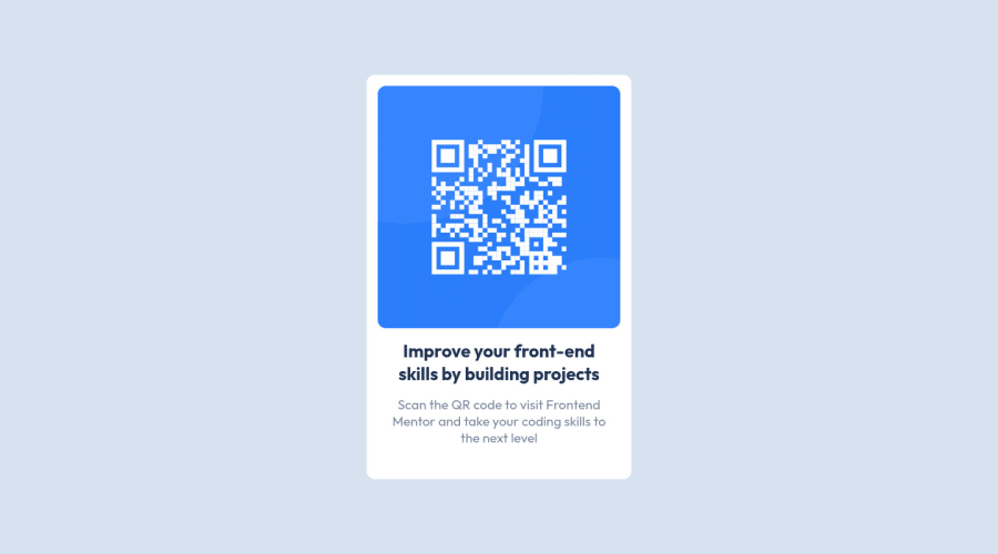
Design comparison
Solution retrospective
Hi everyone π
I'm having trouble with sizing to scale of the design. Is there a technique that I'm missing that makes it easier than just flipping back and forth? Or is this the best it gets π
Currently, I'm putting them side (design) by side (code) and "guess checking".
Community feedback
- @becckmanPosted over 2 years ago
Hey!
Without the pro version and figma files you need to eyeball it as far as I know, so it can be difficult to get the correct scale. In a real working environment with designers you will have access to the figma styles however so I'd say the overall functionality and proportions is more important in this case. I'm just a few projects in but already noticing my "eyeballing" is getting much better.
Your solution could use some more margin under the QR image, other than that you nailed it! :)
Marked as helpful2@dyntbnPosted over 2 years ago@becckman
Ohhh! That makes so much sense. Also you answered a question I didn't even know I had (about the workplace). Having the measurements given from designers from the start would be pretty sweet.π
Relief to hear that eyeballing gets easier, thank goodness! I was struggling for a good bit, but now I'll try to focus on the overall (and those margins).
Thank you for the compliments, made my day reading this.
1 - @dtomicicPosted over 2 years ago
Yeah as the previous comment said, without pro it's just your best guess that does it and making a responsive and functional project is way more important than the scale of it so that shouldn't even be a priority for you. All the projects I do I try first to get the right design (shapes, borders, font sizes, colors, approximate widths of stuff and so on) and then I go on to the functionality (which you'll get to when you start working with JS and such) and then the last thing I do is trying to make it look the same size so yeah as I said looks and functionality should always come to your before looking if the design and your solution are the same sizes so no worries about that haha if you get the pro or once you start doing this for a job previous comment said you'll get access to all the design files and that's right and then you'll be able to fully do the design as intended.
Good job anyhow, keep at it :D
Marked as helpful1@dyntbnPosted over 2 years ago@dtomicic
Having pro would be worth it for these challenges, I see now. Also having those design files given at work is a giant relief, you have no ideaπ
I did spend a lot of time getting the sizing right, other than, the overall project. And I 100% agree with what you said now about just focusing on the important aspect of the challenges of responsiveness and functionality.
I also liked that your breakdown process, I'm definitely borrowing that. Also, since I'm just starting, so I appreciate you mentioning the JavaScript in your breakdown.
Thanks Darko, I'll keep at it! π
1@dtomicicPosted over 2 years ago@dyntbn
No problem, glad I could be of help :D if you ever need any help or advice anything feel free to contact me I'd be more than glad to help you. Good luck :)
1
Please log in to post a comment
Log in with GitHubJoin our Discord community
Join thousands of Frontend Mentor community members taking the challenges, sharing resources, helping each other, and chatting about all things front-end!
Join our Discord