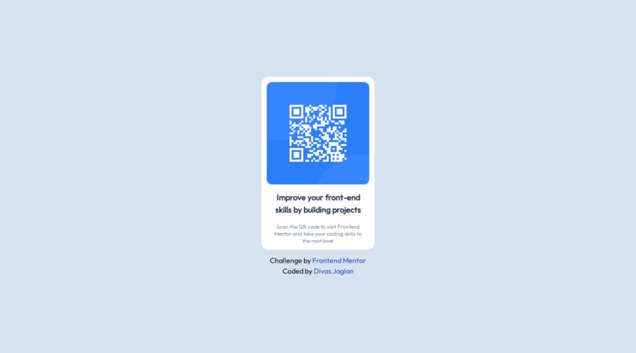
Design comparison
SolutionDesign
Solution retrospective
What are you most proud of, and what would you do differently next time?
Proud of starting my Tailwind css journey with this small project
What challenges did you encounter, and how did you overcome them?It's my first project so faced some problems in this. The first I faced was to center the card then I came up the solution given below:-
- used h-screen to make the element the height of the screen
- used flex to make the element a flexbox
- used items-center to vertically center it
- used justify-center to center it horizontally
And the tailwind css docs helped me a lot in this
What specific areas of your project would you like help with?I just started my journey in this framework so I don't know about my weaknesses yet
Community feedback
Please log in to post a comment
Log in with GitHubJoin our Discord community
Join thousands of Frontend Mentor community members taking the challenges, sharing resources, helping each other, and chatting about all things front-end!
Join our Discord
