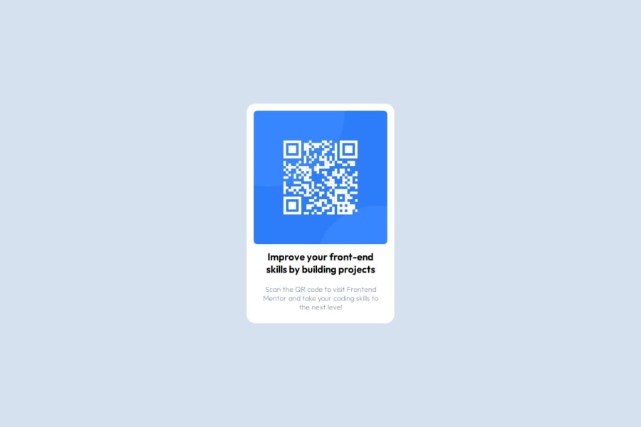
Design comparison
Solution retrospective
I'm most proud of being able to remember HTML and CSS syntax after several months of not coding. It was encouraging to see that I could quickly get back into the flow of building a project, even after some time away from it. However, next time I would focus on how to use the Figma design file more effectively. Instead of guessing and refactoring code until it aligns with the design, I want to make a more systematic approach. I could use the Figma file to better understand the design elements and how they should translate directly into CSS (e.g., spacing, font sizes, colors), which would help streamline the development process and reduce unnecessary tweaks.
What challenges did you encounter, and how did you overcome them?Background Color Not Applying Correctly in the section: One of the challenges I faced was ensuring that the background color of the section element applied correctly. Initially, the background color was being overridden by the universal selector (*) that applied a global background color to all elements. This caused the section's background to appear as the primary color, instead of the intended white. Solution: I removed the global background color rule applied to all elements and specifically set the background color of the body and the section to the correct values (primary for the body, primarywhite for the section).
Image Overflowing the Section: Another challenge was the image inside the element overflowing the boundaries of the section container. The image wasn't constrained within the section’s width, which caused it to extend beyond its container. Solution: I used width: 100% and height: auto on the image to make it responsive and fit properly within the section. Additionally, I used object-fit: cover to control how the image fills the container without distortion. This solution ensured the image displayed correctly without any overflow.
What specific areas of your project would you like help with?I’d appreciate help with simplifying my HTML code, particularly by identifying areas where I could have streamlined the structure or reduced unnecessary elements.
Community feedback
- P@eminahadziccPosted 5 months ago
Good work. I like how you divided everything in the css stylesheet, even with this the code is readable and looks very structured. The solution does differ a bit from the design but I read that you didn't use the Figma design but was guessing and refactoring. In that case an even better job at making the solution look like the design.
0
Please log in to post a comment
Log in with GitHubJoin our Discord community
Join thousands of Frontend Mentor community members taking the challenges, sharing resources, helping each other, and chatting about all things front-end!
Join our Discord
