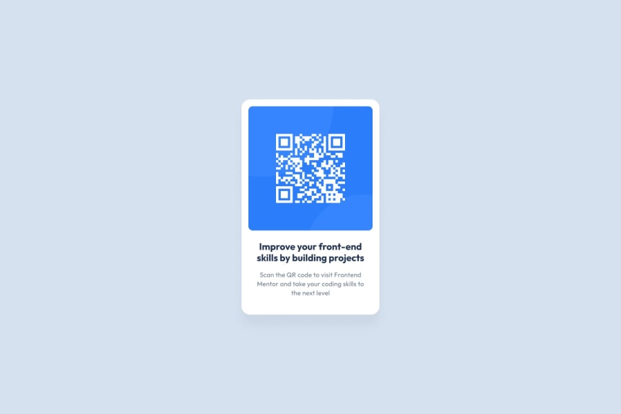
Design comparison
SolutionDesign
Solution retrospective
Please check and give me feedback
Thanks
Community feedback
- @JunoFieldPosted over 2 years ago
Hi,
Congrats on completing the project. Some things that come to mind:
- On the "Improve your fr..." section, your font size is much too large. Just decreasing this would make a big difference to the page's appearance.
- Your centre card and QR code currently have black borders - to disable this, simply add
border: none;to the CSS for those sections. - Element IDs should be named descriptively - names like
wrapperare a big no-go. Instead use names likecentre-card,text-section, etc. - There's a few HTML and accessibility issues - I'll leave you to work those out, as it's good experience to solve those yourself (with the help of Google).
- Once you've made these main changes, play around with margins, padding, etc. to get it looking as close to the design as possible.
Good luck!
0
Please log in to post a comment
Log in with GitHubJoin our Discord community
Join thousands of Frontend Mentor community members taking the challenges, sharing resources, helping each other, and chatting about all things front-end!
Join our Discord
