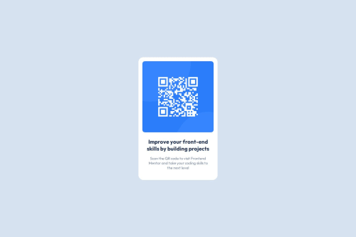
Submitted almost 2 years agoA solution to the QR code component challenge
Responsive QR code component
@leykerjsm

Solution retrospective
What are you most proud of, and what would you do differently next time?
I'm starting using SASS for the first time in a porject, I think I did not too bad
What challenges did you encounter, and how did you overcome them?The most challenging part for me was looking up the styles in figma
What specific areas of your project would you like help with?I need review on the structure of my SCSS file and HTML
Code
Loading...
Please log in to post a comment
Log in with GitHubCommunity feedback
No feedback yet. Be the first to give feedback on Leyker's solution.
Join our Discord community
Join thousands of Frontend Mentor community members taking the challenges, sharing resources, helping each other, and chatting about all things front-end!
Join our Discord