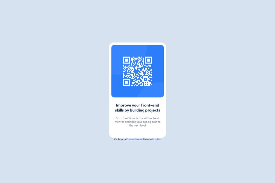
Responsive QR Code challenge using HTML & CSS Flexbox
Design comparison
Solution retrospective
Hard to say what I'm most proud of but If I had to choose one thing It would be the way I used Flexbox, It has been one of my biggest struggles so far and I think I did a good Job.
What challenges did you encounter, and how did you overcome them?My biggest challenge was getting the dimensions and scales right for the different screen resolutions, the way I overcame this challenge was by simply inspecting the page and eyeballing the dimensions.
What specific areas of your project would you like help with?- HTML structure;
- CSS Flexbox;
- CSS Paddings & Margins.
Community feedback
- @luqmanx1998Posted about 1 month ago
Hey there, great job on your first challenge ! It looks amazing, almost pixel perfect. Here are some suggestions :
-
Although this is a very small card challenge, it might be a good idea practicing having descriptive class names ! For example, instead of using
<div class="container">
, you can try maybe using<div class="card">
. -
I see that you've explicitly set your card's height and width. Perhaps instead of doing that, you should consider using
max-height
andmax-width
instead, as these properties allow your card to be responsive, so they can shrink and grow according to the screen size !. -
In your
container
div, there is actually no need to usedisplay: flex
andflex-direction: column
. This is because both theh2
andp
tag are block-level elements, meaning that they occupy the entire width of their container.
Extra suggestions :
Perhaps instead of defining margins for every element in your card, it might be easier to simply group them together by putting them in a
div
, for example, yourh2
andp
tag can go together in one div. After that, you can apply styling on this container, such as your margin-inline, and other margins. Also it might be a good idea to add padding to the card. This way you can define padding for all four corners of the card, and reduce the need to re-define margins repeatedly.Consider using
rem
andem
units instead, as this also helps with responsiveness. Here's a video by Kevin Powell that's worth checking out on this !If you found this feedback helpful, feel free to leave me helpful remark and thumbs up ! Good luck on your next challenge !
Marked as helpful0@Soy-IbragPosted about 1 month ago@luqmanx1998 Thanks for the useful tips and for taking your time to help me!
0 -
- @cristian-souzaPosted about 1 month ago
Nesse trecho deixaria somente o height e não colocaria align-items: center; main{ width: 100vw; height: 100vh; display: flex; align-items: center; justify-content: center; flex-direction: column; }
deixando o código assim main{ height: 100vh; display: flex; justify-content: center; flex-direction: column; }
Marked as helpful0
Please log in to post a comment
Log in with GitHubJoin our Discord community
Join thousands of Frontend Mentor community members taking the challenges, sharing resources, helping each other, and chatting about all things front-end!
Join our Discord