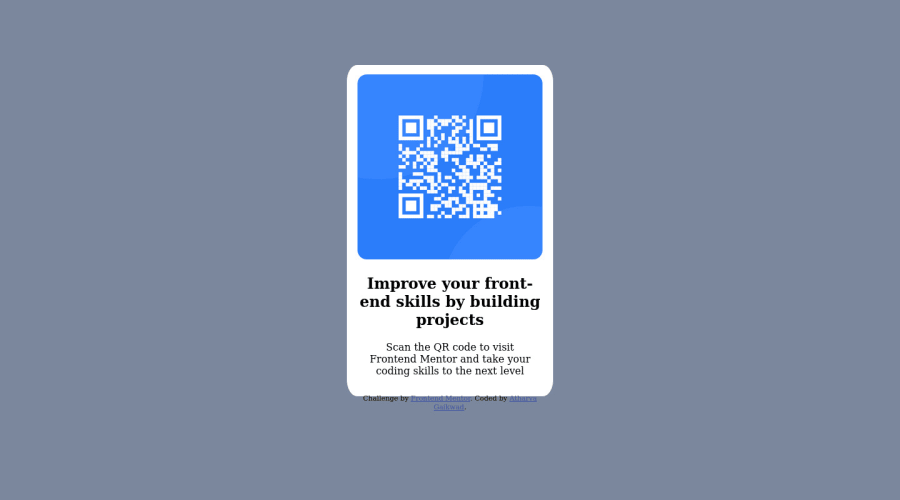
Responsive QR Code Challenge using HTML and CSS
Design comparison
Community feedback
- @MelvinAguilarPosted almost 2 years ago
Hello 👋. Congratulation on successfully completing your first challenge 🎉 ! !
I have other recommendations regarding your code that I believe will be of great interest to you.
Alt text 📷:
-
To make the alt attribute as useful and effective as possible, avoid using words such as "image", "photo", or "picture" as they are redundant because the image tag already conveys that information. Instead, try to make the description as human-readable and understandable as possible.
The alt attribute should explain the purpose of the image, for example, in the case of a QR code, a description like "qr code to frontendmentor.io" would be more appropriate.
If you want to learn more about the
altattribute, you can read this article. 📘.
Font 🔤:
-
It's recommended that you always use the font provided by the challenge's style guide.To import a font, follow the steps below:
- Go to the font's page on Google Fonts: https://fonts.google.com/specimen/Outfit.
- A sidebar will appear with a code snippet that you can use to import the font.
- Copy this code snippet and paste it into the <head> section of your HTML document.
- Now you can use the "Outfit" font in your CSS by specifying
font-family: 'Outfit', sans-serif;.
I hope you find it useful! 😄 Above all, the solution you submitted is great!
Happy coding!
Marked as helpful1@Atharva-0710Posted almost 2 years ago@MelvinAguilar Thanks a lot Melvin for your suggestion! Have a great day.
0 -
- @HassiaiPosted almost 2 years ago
Replace <section class="main"> with the main tag and <h2> with <h1> to fix the accessibility issues. click here for more on web-accessibility and semantic html
<div class="attribution"> should be out of <section class="main"> and wrapped within a footer tag .The body has a wrong background-color.
To center .main on the page using flexbox or grid instead of a margin, add min-height:100vh; display: flex; align-items: center: justify-content: center; or min-height:100vh; display: grid place-items: center to the body.
To center .main on the page using flexbox:
body{
min-height: 100vh;
display: flex;
align-items: center;
justify-content: center;
}
To center .main on the page using grid: body{ min-height: 100vh; display: grid; place-items: center; }There is no need to give .main a height value. For a responsive content which wont require a media query for this challenge, replace the width in .main with a max-width.
Give the img a max-width of 100%, instead a width and height values.
Give h1 and p the same font-size of 15px, text-align: center,the same margin-left, margin-right and margin-top values. Give p a margin bottom value.
Use relative units like rem or em as unit for the padding, margin, width values and preferably rem for the font-size values, instead of using px which is an absolute unit. For more on CSS units Click here
Hope am helpful.
Well done for completing this challenge. HAPPY CODING
Marked as helpful1@Atharva-0710Posted almost 2 years ago@Hassiai Thanks for your help! I have one more doubt! When I'm using flex to center the main section, the footer is also coming to the side of the main section. How to push it to the bottom?
0@HassiaiPosted almost 2 years ago@Atharva-0710 add flex-direction: column to the body.
1@Atharva-0710Posted almost 2 years ago@Hassiai Hey thanks a ton for your reply. I cant express my happiness. Thanks a lot...
0
Please log in to post a comment
Log in with GitHubJoin our Discord community
Join thousands of Frontend Mentor community members taking the challenges, sharing resources, helping each other, and chatting about all things front-end!
Join our Discord
