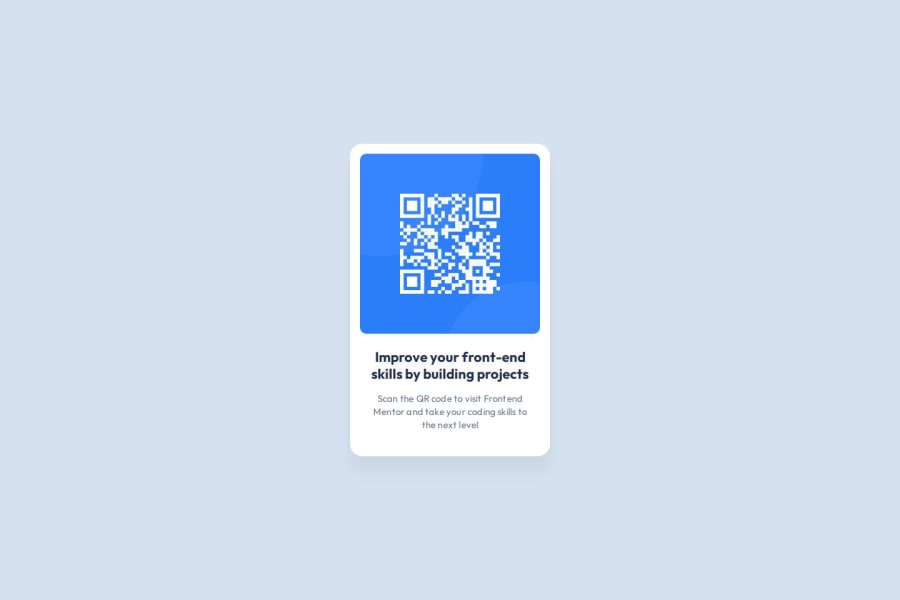
Design comparison
SolutionDesign
Solution retrospective
What are you most proud of, and what would you do differently next time?
I was able to make good use of Flexbox to center the card and make it responsive
What specific areas of your project would you like help with?- I wrapped card image, title and text in individual
divs. Is it advisable to do it this way or is there a better way to do it? - Tried to use BEM nomenclature for class names. Please let me know if I made any mistakes!
- Little confused about the use cases of margins and padding. Is there any good resource out there which explains their proper use?
- Any alternatives to media queries so that I don't have to write them for every screen size?
Community feedback
Please log in to post a comment
Log in with GitHubJoin our Discord community
Join thousands of Frontend Mentor community members taking the challenges, sharing resources, helping each other, and chatting about all things front-end!
Join our Discord
