Design comparison
SolutionDesign
Community feedback
- @AnteonallenPosted 5 months ago
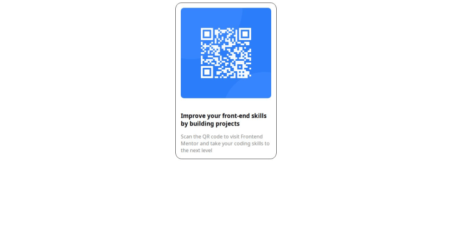
QR code should be in the center as much as possible. You could use margin and justify content to help you. Your background need to be changed to background-color: hsl(212, 45%, 89%);
0
Please log in to post a comment
Log in with GitHubJoin our Discord community
Join thousands of Frontend Mentor community members taking the challenges, sharing resources, helping each other, and chatting about all things front-end!
Join our Discord
