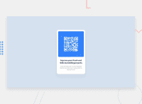
Design comparison
Community feedback
- @correlucasPosted about 2 years ago
👾Hello Mathan, congratulations for your new solution!
The only reason your component card is not responsive yet is due the
imgsetup, a best practice for the images is to usedisplay: blockandmax-width: 100%this helps you manage images and also means that the image will have the size of the container it is inside less the paddings.See the code fixes below:
img {
    display: block;
    border-radius: 0.625rem;
    max-height: 17rem;
    max-width: 100%;
}
Improve the
box-shadowworking the values foropacityandblur. If you give it more blur and less opacity you'll have a smoother shadow.👋 I hope this helps you and happy coding!
Marked as helpful0@gmathankumarPosted about 2 years ago@correlucas thanks for taking time and review it. I'll go through the suggested changes.
1
Please log in to post a comment
Log in with GitHubJoin our Discord community
Join thousands of Frontend Mentor community members taking the challenges, sharing resources, helping each other, and chatting about all things front-end!
Join our Discord

