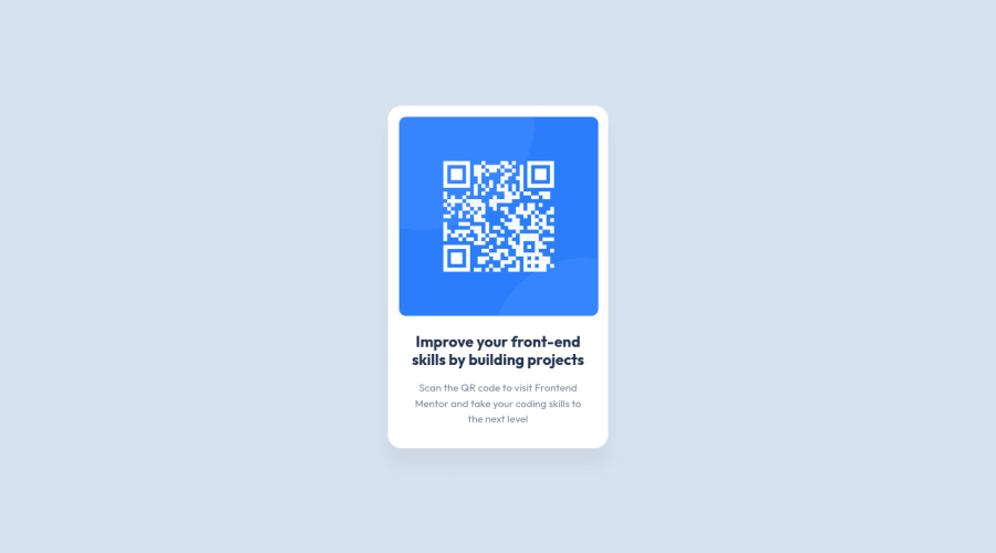
Responsive QR code card using CSS and bootstrap
Design comparison
Solution retrospective
Continued development
It would be helpful to understand
-
The reason why some added values in CSS need "!important" to actually show up.
-
How to center any element in the screen regardless of the screen/browser/device used
Community feedback
- @grace-snowPosted about 3 years ago
I recommend you don't use bootstrap or any other libraries while learning. This will actually hold back your progress.
If you learn css, html and js yourself you'll be able to easily pick up any library you want later on and understand exactly what they're doing, why they're doing it and what the trade offs are in each library.
Good luck
Marked as helpful1@MabchirPosted about 3 years ago@grace-snow Thank you for your advice ! for some reason I thought it's helpful to know all the libraries as it makes things faster but I will definitely follow your advice to have a good foundation.
0 - @nakoyawilsonPosted about 3 years ago
Adding to @denielden 's comment, in your index.html file you have inline css on line 26 (
<div class="card" style="width: 18rem">). If you remove thestyle="width: 18rem"then you would not need the !important for thewidth: 320px;for the card in your style.css file.Marked as helpful1@MabchirPosted about 3 years ago@nakoyawilson Ohhh ! that makes sense ! Thank you so much !
1 - @denieldenPosted about 3 years ago
Hi Mariem, great job! Congratulations on completing the challenge.
- The reason why you sometimes have to use
!importantis because the css is read in cascade and the last classes overwrite the previous ones. It is a good idea to use as little as possible!importantbecause it makes management of the CSS difficult. - The best way to center the element is to use flexbox
It would be helpful to understand:
Also i have a few suggestions for you:
- add
maintag and wrap the card for Accessibility - remove
position: absolute; top and leftproperties fromcardclass - use flexbox to the body for center the card. Read here -> flex guide
- set
heigthof body to100vhbecause Flexbox aligns to the size of the parent container.
Overall you did well :)
Hope this help and happy coding!
Marked as helpful0@MabchirPosted about 3 years ago@denielden Thank you for the detailed feedback and resources. That's very helpful!
1@denieldenPosted about 3 years ago@Mabchir You are welcome! And don't forget to mark my comment as helpful :) thanks
Marked as helpful0 - The reason why you sometimes have to use
- @EmmanuelHexerPosted about 3 years ago
Great job overall man. Keep it up
- To fix your accessibility issues wrap your card with
mainelement.
Marked as helpful0@MabchirPosted about 3 years ago@Phalcin what do you mean by accessibility? I wrapped it in main but I don't see much difference. would you mind elaborating more ?
Thank you so much for taking the time to help me out !
0@EmmanuelHexerPosted about 3 years ago@Mabchir Just below where your solution is, there is a report section there. You can see it notifies you that you have one accessibily issues. So you can click view report and then update the report.
Marked as helpful0 - To fix your accessibility issues wrap your card with
- @alihuseynzade23Posted about 3 years ago
Hi @Mabchir.
It is look like your qr component not well centered. Try to use position: absolute with top and left 50%. Do not forget about translate: rotate too.
Good luck :)
0@MabchirPosted about 3 years ago@AleksHNZ Thank you Ali ! I actually used those percentages but it didn't really center things well. so I opted for @danielden 's suggestion and used flex box. I think it's better now
2@grace-snowPosted about 3 years ago@AleksHNZ that's not a good way to center things in modern Web development. Much better to use css grid or flexbox so your elements stay ing the document flow
1
Please log in to post a comment
Log in with GitHubJoin our Discord community
Join thousands of Frontend Mentor community members taking the challenges, sharing resources, helping each other, and chatting about all things front-end!
Join our Discord
