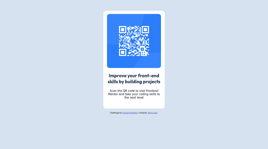
Responsive Qr code card design using CSS margin &Flex
Design comparison
Solution retrospective
What did you find difficult while building the project Are you available for pair programming
Community feedback
- @VCaramesPosted about 2 years ago
Hey @ikemefuna123, some suggestions to improve you code:
A lot of you CSS code needed to improved. You have a lot of things that were unnecessary.
Instead of writing everything that was wrong, I'll provide you with the essentials, of how your code should off been. You'll then use it to adjust the minor things, like font-size, padding, etc..
body {

   background-color:  hsl(212, 45%, 89%);
   font-family: 'Outfit', sans-serif;

    min-height: 100vh;
    display: flex;
    justify-content: center ;
    align-items: center ;
    flex-direction: column ;
}

.main {
    max-width: 320px;
    text-align: center;
    background: white;
    padding: 20px;
    border-radius: 20px;


}

img {
    max-width: 100%;
    display: block;
}
Happy Coding!
Marked as helpful0@ikemefuna123Posted about 2 years ago@vcarames Wow, thanks a lot I appreciate it man❤️
Can you also be my mentor.
0 - @correlucasPosted about 2 years ago
👾Hi @ikemefuna123, congratulations on your solution!👋 Welcome to the Frontend Mentor Coding Community!
Great solution and a great start! From what I saw you’re on the right track. I’ve few suggestions for you that you can consider adding to your code:
Add
<main>instead of<div>to wrap the card container. This way you show that this is the main block of content and also replace the div with a semantic tag.Replace the
<h3>containing the main title with<h1>note that this title is the main heading for this page and every page needs one h1 to show which is the most important heading. Use the sequence h1 h2 h3 h4 h5 to show the hierarchy of your titles in the level of importance, never jump a level.Clean your code by removing some unnecessary divs, most of the content can stand alone without a div. Use div only for blocks that need a special alignment or the content needs a special positioning.
Add a margin of around
margin: 20pxto avoid the card touching the screen edges while it scales down.Use relative units as
remoreminstead ofpxto improve your performance by resizing fonts between different screens and devices. These units are better to make your website more accessible. REM does not just apply to font size, but to all sizes as well.Here's my solution for this challenge if you wants to see how I build it: https://www.frontendmentor.io/solutions/qr-code-component-vanilla-cs-js-darklight-mode-nS2aOYYsJR
✌️ I hope this helps you and happy coding!
0
Please log in to post a comment
Log in with GitHubJoin our Discord community
Join thousands of Frontend Mentor community members taking the challenges, sharing resources, helping each other, and chatting about all things front-end!
Join our Discord
