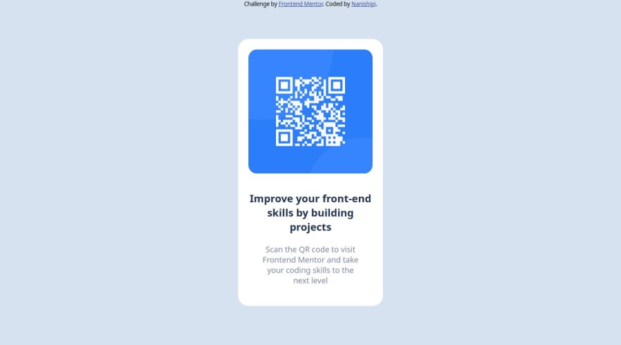
Design comparison
Community feedback
- P@flaviare1sPosted 11 months ago
Olá! Seu trabalho está muito bom, mas na tela do meu celular não ficou responsivo. Você poderia tentar fazer algumas alterações, tipo:
body { width: 100vw; }
.qr-card { margin: auto; width: 280px; position: absolute; top: 50%; left: 50%; transform: translate(-50%, -50%); background-color: white; padding: 2rem; border-radius: 2rem; }
@media (max-width: 375px) { .qr-card { width: 80%; } }
I would also delete the other media query.
Hope this helps. :)
Marked as helpful0 - @emjayrukaPosted 11 months ago
Hey nanishipi. I can see that you've put a lot of effort and dedication into this. I'd like to offer some constructive feedback that may enhance the overall structure and functionality of your work. It seems the project relies heavily on generic <div> tags rather than utilizing semantic HTML elements such as <main>, <nav>, and <footer>. Incorporating these elements can significantly improve the document's structure, making it more accessible and easier to understand. For example, the <div.container> could be replaced with a <main> tag, while the <div.attribute> could be replaced with a <footer> tag.
I believe these adjustments will benefit your future projects and also contribute to their overall accessibility and maintainability.
I hope I was of help.
Well done for completing this challenge. HAPPY CODING
Marked as helpful0
Please log in to post a comment
Log in with GitHubJoin our Discord community
Join thousands of Frontend Mentor community members taking the challenges, sharing resources, helping each other, and chatting about all things front-end!
Join our Discord
