


@Hassiai
Posted
Replace<div class="wrapper">with the main tag, <h2> with <h1> and <div class="attribution"> with the footer tag to make the page accessible. click here for more on web-accessibility and semantic html
Every html must have <h1> to make it accessible. Always begin the heading of the html with <h1> tag wrap the sub-heading of <h1> in <h2> tag, wrap the sub-heading of <h2> in <h3> this continues until <h6>, never skip a level of a heading.
the body has a wrong background-color, give it a background-color of light-gray. Use the colors and the font-family that were given in the styleguide.md found in the zip folder you downloaded.
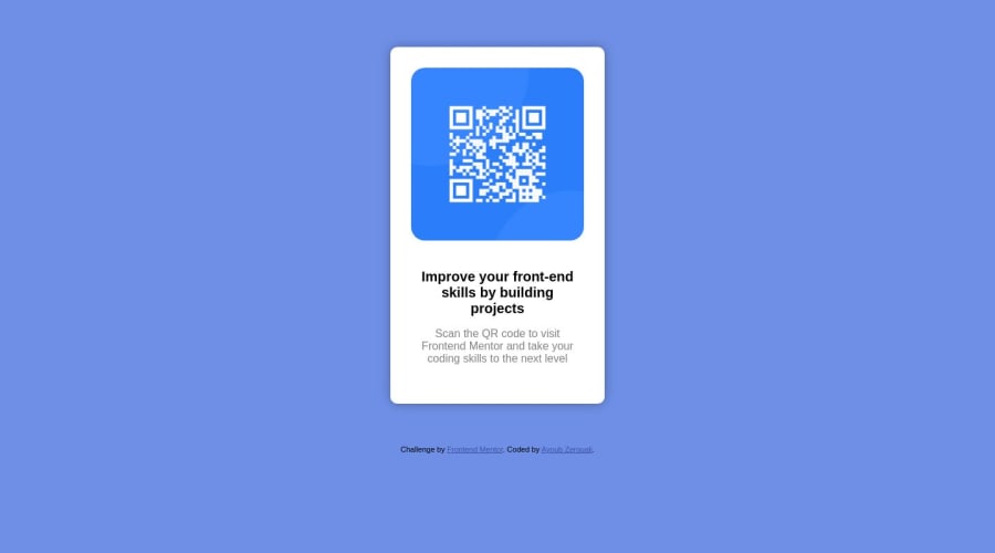
There is no need to style .card, .img-holder and .wrapper.
to center .card-body on the page using flexbox or grid instead of position: absolute and position: relative and their properties:
- USING FLEXBOX: add min-height:100vh; display: flex; align-items: center: justify-content: center; to the body
body{
min-height: 100vh;
display: flex;
align-items: center;
justify-content: center;
}
- USING GRID: add min-height:100vh; display: grid place-items: center to the body
body{
min-height: 100vh;
display: grid;
place-items: center;
}
Use relative units like rem or em as unit for the padding, margin, width values and preferably rem for the font-size values, instead of using px which is an absolute unit. For more on CSS units Click here and here
For a responsive content,
- Replace the width in .card-body with max-width, increase its value and reduce the padding value for all the sides
max-width: 320px which is 20rem/em padding:16px which is 1rem/em - Give the img a max-width of 100% and a border-radius value, the rest are not needed.
Give .content-box a margin value for all the sides, text-align: center and a font-size of 15px which is 0.9375rem, this will be the font-size of both p and h1. Give p a margin-top or h1 a margin-bottom value for the space between the text.
Hope am helpful.
Well done for completing this challenge. HAPPY CODING
Marked as helpful
