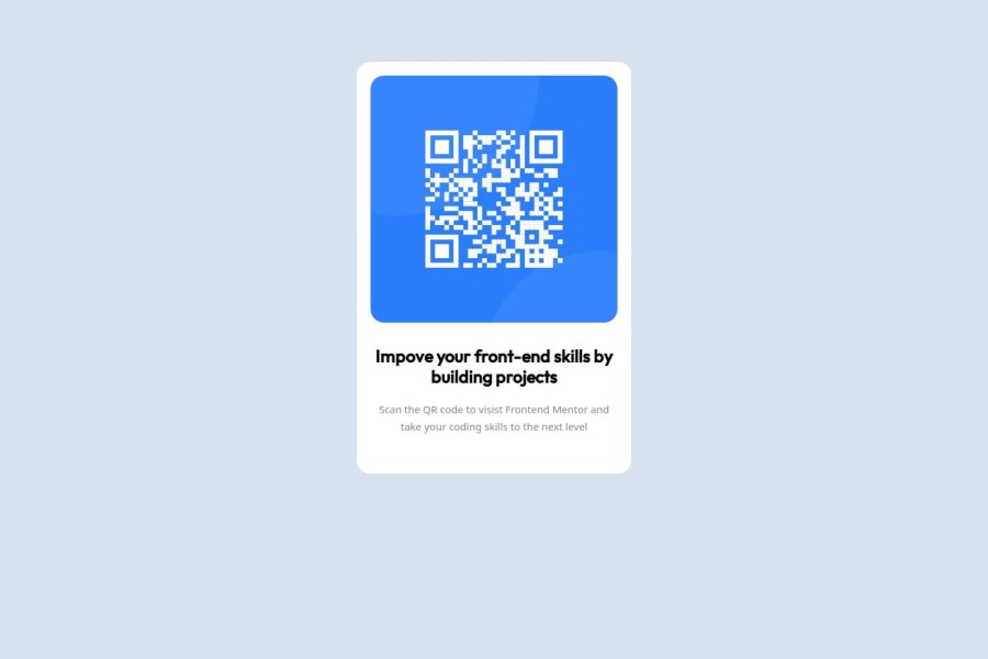
Design comparison
SolutionDesign
Solution retrospective
What are you most proud of, and what would you do differently next time?
Responsive design, add sleek ui on smaller screens
What specific areas of your project would you like help with?Feedback appreciated!
Community feedback
- P@whiteriver-devPosted 6 months ago
Try centering it more, if you look closer - the design is in the centre of the page, whereas yours is towards the top. I had the same problem and to fix it, I made sure that body was full width and height. Then I used display flex, and ensured that content is justified and aligned to centre. Hope this helps!
0
Please log in to post a comment
Log in with GitHubJoin our Discord community
Join thousands of Frontend Mentor community members taking the challenges, sharing resources, helping each other, and chatting about all things front-end!
Join our Discord
