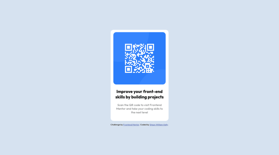
Design comparison
Solution retrospective
I used this code for my container display: flex; flex-direction: column; justify-content: center; align-items: center; height: 100vh; I used the column direction to get the attribute under the QR box. Is this the best practice or is there a better way?
In my attribution section I used width: max-content; I used this to keep the text from flowing into the next row when the screen shrank too much. Is this best practice?
Community feedback
- @0xabdulkhaliqPosted over 1 year ago
Hello there 👋. Congratulations on successfully completing the challenge! 🎉
- I have other recommendations regarding your code that I believe will be of great interest to you.
HTML 🏷️:
- This solution generates accessibility error reports, "All page content should be contained by landmarks" is due to
non-semanticmarkup, which causes lacking of landmark for a webpage
- So fix it by replacing the
<div class="container">element with the semantic element<main>in yourindex.htmlfile to improve accessibility and organization of your page.
- What is meant by landmark ?, They used to define major sections of your page instead of relying on generic elements like
<div>or<span>. They are use to provide a more precise detail of the structure of our webpage to the browser or screen readers
- For example:
- The
<main>element should include all content directly related to the page's main idea, so there should only be one per page - The
<footer>typically contains information about the author of the section, copyright data or links to related documents.
- The
HEADINGS ⚠️:
- This solution has also generated accessibility error report due to lack of level-one heading
<h1>
- Every site must want at least one
h1element identifying and describing the main content of the page.
- An
h1heading provides an important navigation point for users of assistive technologies, allowing them to easily find the main content of the page.
- So we want to add a level-one heading to improve accessibility by reading aloud the heading by screen readers, you can achieve this by adding a
sr-onlyclass to hide it from visual users (it will be useful for visually impaired users)
.
I hope you find this helpful 😄 Above all, the solution you submitted is great !
Happy coding!
Marked as helpful0@ShaunwkPosted over 1 year ago@0xAbdulKhalid Thank you! Appreciate the insight so I can improve on the next project!
0 - @0xabdulkhaliqPosted over 1 year ago
@Shaunwk
SUGGESTION 💡
- "I used this code for my container display: flex; flex-direction: column; justify-content: center; align-items: center; height: 100vh; I used the column direction to get the attribute under the QR box. Is this the best practice or is there a better way?"
- Yes there's a better way, we can use
Gridlayout to center the component
body {
    min-height: 100vh;
    display: grid;
    place-items: center;
}
.
I hope you find this valuable feedback helpful ! 🤠
0
Please log in to post a comment
Log in with GitHubJoin our Discord community
Join thousands of Frontend Mentor community members taking the challenges, sharing resources, helping each other, and chatting about all things front-end!
Join our Discord
