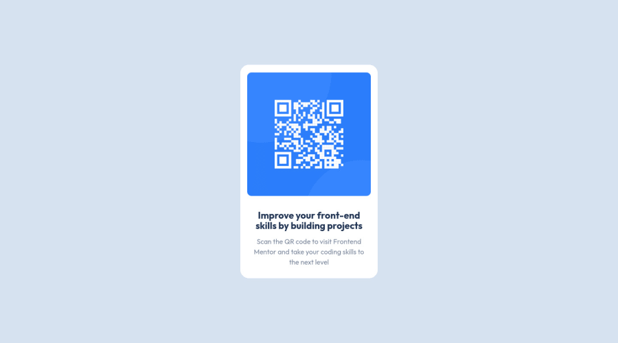
Design comparison
Solution retrospective
By doing this, i think what i have done just tried to make the apps more looks like the design and kinda follow the css structure about the spacing and font size scale. I still kinda a bit needs what to focus. am i have to follow strict rule or not ?
Community feedback
- @shashreesamuelPosted about 3 years ago
Hey fbtwitter, good job completing this challenge. Keep up the good work
Your solution looks good however I think the card title needs a bit of line height.
In terms of your accessibility issue, images need alternative text, simply mention the
altattribute and for the value give a description of the image.I hope this helps
Cheers Happy coding 👍
Marked as helpful0 - Account deleted
hi there,
- add alt attribute to the image
Marked as helpful0 - @fbtwitterPosted about 3 years ago
Thank you for the feedback, Yes, I already add some additional value for the alt image and to be sure i wanted to ask, is there any particular number for the line height ? things i has learned that all values above 16px surely had to get number below than 1.5 so i put 1.25 there. is there any fixes for the number ? or that's just an opinionated visual look perspective?
0
Please log in to post a comment
Log in with GitHubJoin our Discord community
Join thousands of Frontend Mentor community members taking the challenges, sharing resources, helping each other, and chatting about all things front-end!
Join our Discord
