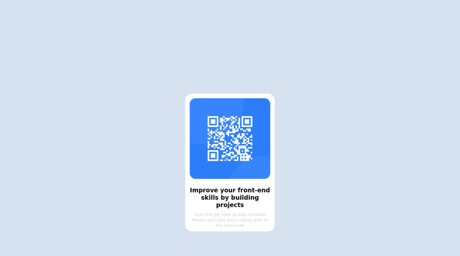
Design comparison
Solution retrospective
Is my code optimal in terme of CSS class Vs. the fact I call many times 'display:grid' and 'display:flex' in different CSS Selector ?
There is another solution to "bind" all this with only one Element instead of writing in each CSS selector?
Should I use REM instead of px in the CSS file for better responsive results?
Community feedback
- @visualdennissPosted over 1 year ago
Hey there,
Good work. I'd suggest removing the padding-top: 100px from the .core; this way your solution will be centered to the screen with the current setup you have. The paragraph text looks a bit too bright, which makes it harder, since there is very low contrast between background the the text. So you might consider darken its value a bit in order to improve readability and user experience.
Hope you find this feedback helpful!
Marked as helpful1 - @fileccPosted over 1 year ago
🌈 Hi and congratulations on completing this challenge!
I’ll try to answer your questions:
- Is my code optimal in terme of CSS class Vs. the fact I call many times 'display:grid' and 'display:flex' in different CSS Selector ?
You can always create a class in you css like
.flex{ display: flex; }
and then use this new class directly in your HTML instead of writing every time. It’s the same if you use a framework like Boostrap or Tailwind.
2.Should I use REM instead of px in the CSS file for better responsive results?
You should always use REM instead of pixel. Above all for accessibility, so everyone looking at you website can still appreciate it even if they’re using a magnifying or something else to enlarge their zoom. Here’s a link from CSS Tricks.
I hope you’ll find this helpful! Happy coding ✨ 🖥️ 🙌
Marked as helpful1 - @Finney06Posted over 1 year ago
Hello there 👋. Good job on completing the challenge !
Here are some suggestions regarding your code that may be of interest to you.
HTML 🏷️:
To clear the Accessibility report:
-
Wrap the page's whole main content in the
<main>
tag. -
Use HTML5 semantic elements such as
<header>
,<nav>
,<main>
,<aside>
, and<footer>
to define these sections. you can use ARIA landmarks such as<header role="banner">
and<footer role="contentinfo">
to provide additional information about the purpose of each section to assistive technologies.
Here is a web accessibility evaluation tool📕 to check your webpage for any remaining errors or warnings related to landmarks.
I hope you find it helpful!😏 Above all, the solution you submitted is 👌. 🎉Happy coding!
Marked as helpful1 -
Please log in to post a comment
Log in with GitHubJoin our Discord community
Join thousands of Frontend Mentor community members taking the challenges, sharing resources, helping each other, and chatting about all things front-end!
Join our Discord