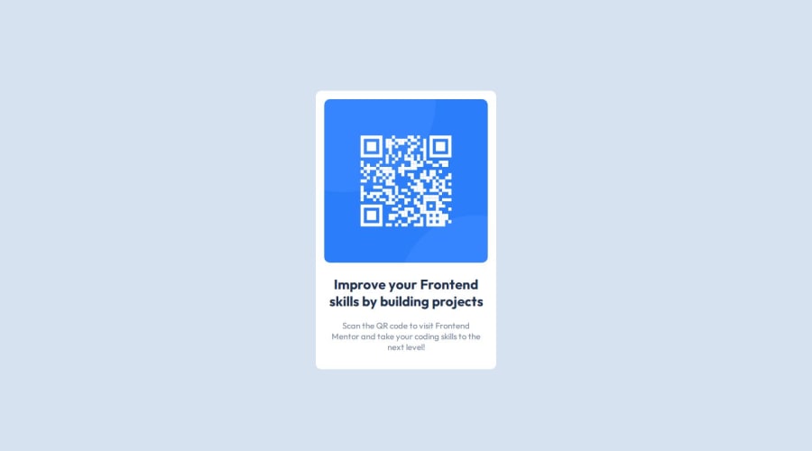
Design comparison
Solution retrospective
Process
I tried to see the different containers needed, which were two in total: main and a text section. It's easy to work with just a couple of containers so it was mainly about aligning and applying styles.
Built with:
- HTML5
- CSS variables
- Grid & Flexbox
- Responsive design
I learned
There's no need to complicate things. I already knew most of these properties so in that regard, there was nothing new, rather this was a reviewing exercise.
I want feedback or guidance in name conventions and semantic HTML :).
Thanks!
Community feedback
- @danielmrz-devPosted 9 months ago
Hello @shinzudev !
Your solution looks great!
I have a couple of suggestions:
- Since you set grid to the body, but you didn't set the size of the rows, your footer is pushing your card up a little bit. You can prevent that from happening adding this to the body:
grid-template-rows: 90% 1fr;Then your card will always occupy 90% of the space and the footer will adapt in the remaining space.
I hope it helps!
Other than that, you did an excellent job!
1@shinzudevPosted 9 months agoHey @danielmrz-dev !
I was wondering why was that happening. Thanks a lot for the tip!
Have a nice day :)
1
Please log in to post a comment
Log in with GitHubJoin our Discord community
Join thousands of Frontend Mentor community members taking the challenges, sharing resources, helping each other, and chatting about all things front-end!
Join our Discord
