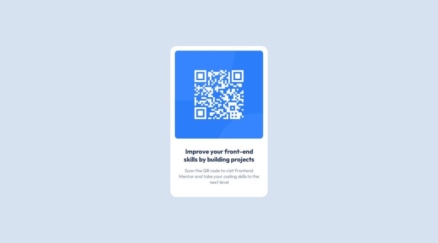
Design comparison
Solution retrospective
i would like to use less chatgpt for the next time now that i already now some topic like how to center a div.
What challenges did you encounter, and how did you overcome them?I didn´t know how to center a div...
What specific areas of your project would you like help with?Hello! I would like to enhance my skills in using flexbox and grid layouts. Additionally, I want to improve the responsiveness of my project by implementing media queries.
Community feedback
- @ahmedyasserdevPosted 11 months ago
Hey Joni , congrats for submitting your first solution and it's awesome by the way, it's pixel perfect , keep going 🔥
Marked as helpful0 - @CobyKalterPosted 11 months ago
This is great work! There is a slight difference in the font size for the H1 and p texts, where the design file is slightly larger. So you may want to review the font-size in the design file to match it.
Marked as helpful0
Please log in to post a comment
Log in with GitHubJoin our Discord community
Join thousands of Frontend Mentor community members taking the challenges, sharing resources, helping each other, and chatting about all things front-end!
Join our Discord
