Submitted over 2 years ago
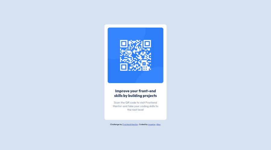
Responsive QR Card using css
#accessibility#materialize-css#sass/scss#styled-components#progressive-enhancement
@Lilee52
Design comparison
SolutionDesign
Solution retrospective
I didn't face any challenges building this, I hope the replication is similar to the design, kindly drop a feedback on what I could have done better.
Community feedback
Please log in to post a comment
Log in with GitHubJoin our Discord community
Join thousands of Frontend Mentor community members taking the challenges, sharing resources, helping each other, and chatting about all things front-end!
Join our Discord
