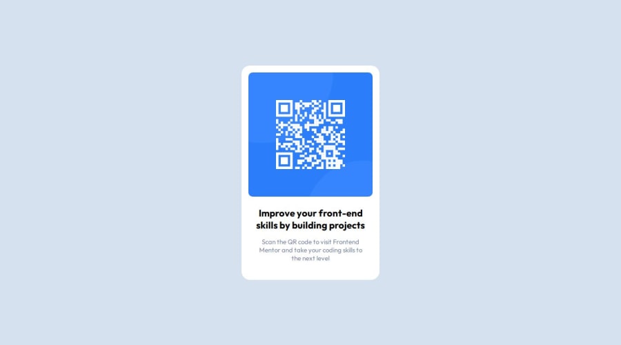
Design comparison
Solution retrospective
Finally, I am able to understand how some of the features of CSS works (such as box-sizing, flexbox, width and height). Next time, I would like to do it with grid layout instead, as I believe I need to practice it in order to understand it.
What challenges did you encounter, and how did you overcome them?At first, I couldn't figure out how to center the whole thing. Then I wanted to try flexbox, as I previously went through some tutorials on it but never practiced it really. And it worked! It is amazing how simple it made it for me.
Another part I struggled with was aligning the paragraph with the above h3 text, as I wanted the text part to align with the imaginary borders of the QR code extending downwards. I ended up with wrapping both elements in a div and setting width to 80%. Worked like a charm.
What specific areas of your project would you like help with?I would like to know what are some ways I could reduce the amount of code I write. I used SCSS as I wanted to learn it and it is quite useful in that regard but maybe I could set some global values that would help with that.
Community feedback
Please log in to post a comment
Log in with GitHubJoin our Discord community
Join thousands of Frontend Mentor community members taking the challenges, sharing resources, helping each other, and chatting about all things front-end!
Join our Discord
