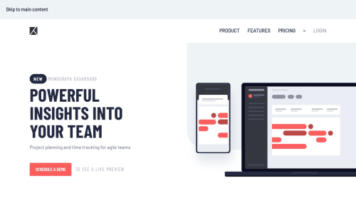
Responsive Project Tracking Homepage with Navigation Toggle Button

Solution retrospective
I'm proud of completing my 9th Junior project!
Built-with:
- HTML
- CSS
- JS
- Vite
This one seemed easy when looking at the design files. But actually, it is a little confusing when it comes to making the image responsive. I gave the image a position: absolute;. This made it harder to make it responsive. So, I had to make it a position: relative; on mobile phones.
In this project, I used CSS grid and flex to achieve the result along with ::after, ::before pseudo-elements. I have locally hosted the fonts with woff, woff2 formats to improve the site's performance.
Getting the navigation bar responsive was easy by using an addEventListener on the toggle button and a classList.toggle() on the menu.
Overall, I really enjoyed making this. Really interesting and helped me improve my CSS grid and flex skills! 🎉
I had difficulties making the image responsive. Mainly because of position: absolute property. Then I had to change it to relative on mobile phones so that it doesn't break. It might not look that close to the design.
I would like to know how it looks on your devices and how I can improve my solution.
Note: I have used Vite to bundle my source files using npm run build. So the code might have readability issues. To view the original code, please follow this link.
Any suggestions are welcome! 😊
Please log in to post a comment
Log in with GitHubCommunity feedback
No feedback yet. Be the first to give feedback on Tharun Raj's solution.
Join our Discord community
Join thousands of Frontend Mentor community members taking the challenges, sharing resources, helping each other, and chatting about all things front-end!
Join our Discord