Submitted almost 4 years ago
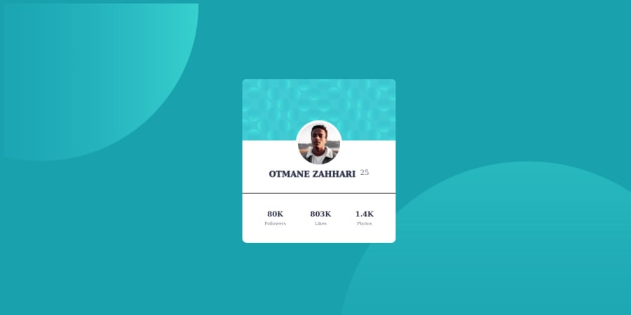
Responsive Profile-card-component with HTML CSS
@otmanezahhari
Design comparison
SolutionDesign
Solution retrospective
If anybody would like to review my code and give me feedback that would be great!
Any other type of feedback is appreciated as well! Thank You!
Community feedback
- @aishwarya-maliPosted almost 4 years ago
Hi ZAHHARI,
Nice work on this challenge!
Here are some pointers after taking a look at your code:
- Please add font according to the Design.
- You can add .profile-card{ overflow: hidden; } instead of giving separate border to .couverture-photo
- You can also avoid using heights instead use padding
- You can also align name and age(I guess) vertically.
- You can add letter-spacing to .card-info-followers span
- You could also add border-top to .card-info-followers instead of hr or could style hr according to design.
I hope this helps. Let me know if you have any questions. Keep it up!
0 - @iamdestinychildPosted almost 4 years ago
Great work i think you should check the fonts
0
Please log in to post a comment
Log in with GitHubJoin our Discord community
Join thousands of Frontend Mentor community members taking the challenges, sharing resources, helping each other, and chatting about all things front-end!
Join our Discord
