Submitted 11 months ago
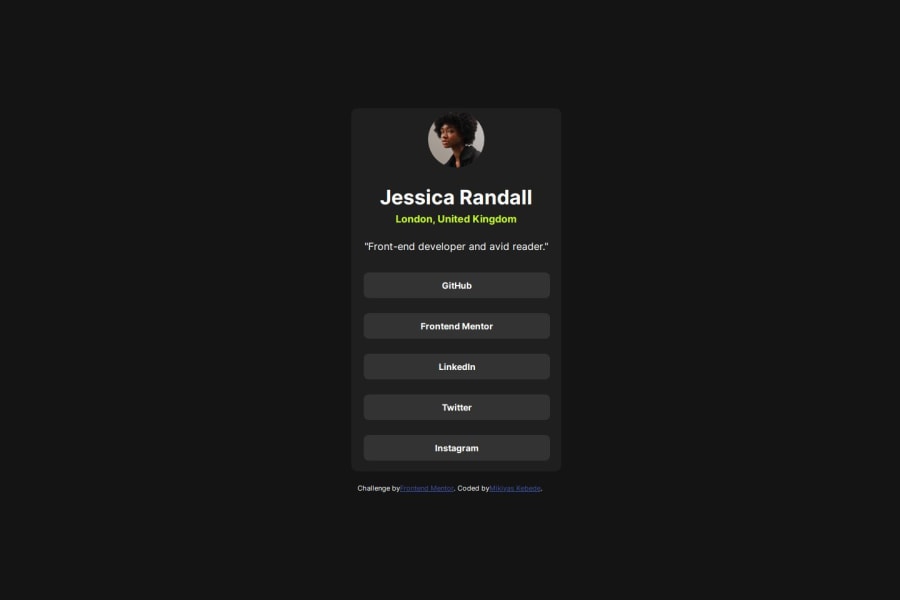
Responsive Profile Social Media links
#vite#vue#sass/scss
@Miki0035
Design comparison
SolutionDesign
Solution retrospective
What are you most proud of, and what would you do differently next time?
I was able to finish this project fast. Now I understand that all those studying and coding are paying off. But still there is room for improvements , like being to understand scss better , this was my first time using it
What challenges did you encounter, and how did you overcome them?I was having some problems trying to use scss , like how to use it in raw HTML . I found the solutions from their documentations and stack overflow
Community feedback
Please log in to post a comment
Log in with GitHubJoin our Discord community
Join thousands of Frontend Mentor community members taking the challenges, sharing resources, helping each other, and chatting about all things front-end!
Join our Discord
