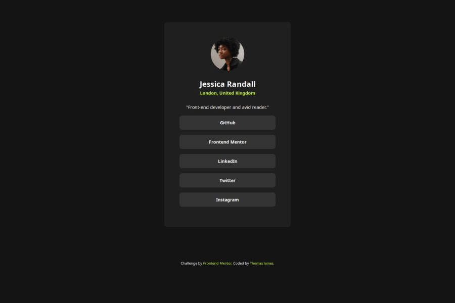
Design comparison
Solution retrospective
- Created an accessible profile page using
:focus
and:focus-visible
selectors. I did not understand the importance of these selectors until I implemented them myself. - Responsive layout for viewport widths and heights.
The trickiest part of this challenge in my case was understanding the importance and implementation of focusable elements.
- Discovering the
outline
CSS property was interesting and seeing where it lies in the Box Model was eye-opening. - Sizing the
elements was tricky (I moved sizing from
tags to the `` tags.
Any constructive feedback is welcome!
- Please let me know if I have implemented the font families correctly! :) (Just discovered the
@font-face
statement in CSS).
Community feedback
- @Alex-Archer-IPosted 4 months ago
Hey!
Your work looks cool and professional. And it's cool that you pay attention to tabbable elements =)
Yep, you implemented font-face correctly, also while you are using variable fonts you can dynamically set the ranges for font weight and stuff.
Also the webdev.com says that you should add
role="list"
to lists when you change it'sdisplay
or appearance. But I really don't know if it's a big deal here =)By the ay, why did you use wrapper with a
grid
for image? And for the list you can achieve the same effect with aflex
=)Marked as helpful1@turtlethomPosted 4 months ago@Alex-Archer-I
Hey Alex! Thanks for taking the time to check out my project! I took a look at webdev.com. I definitely see the importance of adding
role="list"
for assistive technologies for other users. (Learning more and more about the importance of ARIA & Accessibility every day!)I used
display: grid
on theimg
wrapper because it was a CSS utility class that I created to center containers instead of selecting a bunch of elements in CSS and centering them individually.- I usually always make some sort of
.container
or.centered
class, dependent what I'm building. - I'm trying to avoid repetition by encapsulating similar styles in a class.
.centered { display: grid; place-items: center; text-align: center; }
<div class="centered bottom-margin"> <img src="assets/images/avatar-jessica.jpeg" alt=""> </div>
display: flex
is usually my go-to for lists, but I was experimenting with CSS Grid in this project to see if I could achieve the same effect :)I'm also curious if you could expand on the applications of dynamic ranges for fonts and font-weights. I'd love to know more!
But seriously appreciate the thoughtful feedback! I'm a newbie and always trying to learn more :)
1@Alex-Archer-IPosted 4 months ago@turtlethom
Yeah, the role attribute needs here to support Safari users, but in most cases just using semantic tags is enough.
I asked about image wrapper cos I can't see why did you need to center it. I mean
img
just a single tag and you can style it directly =)But I like your system approach to the classes naming. Do you make it up by yourself? And did you learn the naming conventions like BEM or OOCSS?
About fonts - when you are using plain fonts you have to get separate font file for every weight you need. Like "font-bold.ttf", "font-small.ttf", "font-thin.ttf" etc. But the variables font file have all variants already inside it. So, when you add it with
font-face
you can set the ranges:@font-face { font-family: "Font"; src: url("./font.ttf"); font-weight: 500 800; }
That way all fonts would be 500 by default and you can use all values between 500 and 800 for css rules. That works not only with the weight, but as far I used it only like this =)
You're welcome! I'm often feels like a newbie too despite I have learn all this stuff about two years already =)
Marked as helpful1@turtlethomPosted 4 months ago@Alex-Archer-I OHH I see!
Thanks for the insight about the
role
attribute and the@font-face
statement!For the
<img>
, you are absolutely right. In retrospect, I realized I could do this instead:<img src="assets/images/avatar-jessica.jpeg" alt="" class="bottom-margin" style="margin-inline: auto">
- I got rid of the unnecessary
<div>
and usedmargin-inline: auto
directly on the image. I'm just so used to throwing everything in a<div>
haha.
For the system of CSS classes I've used, I've taken inspiration from Kevin Powell on Youtube; he's heavily inspired my thought process when it comes to OOCSS.
- I strive to make things as modular and reusable when possible
- I find if I'm repeating certain styles, I'll see if I can create a CSS class to reduce bloat in the CSS selectors and in the file overall.
- I also use a
normalize.css
file to always set some default styles instead of trying to memorize the declaration. I really liked the styles from here: A (more) Modern CSS Reset
Example:
/* Box-Sizing Adjustment */ *, ::before, *::after { box-sizing: border-box; }
- Just gets rid of any weird, unintuitive default behaviors when sizing elements.
Again, thank you so much for the constructive feedback this is all really helpful! You've provided solid advice and clarity on things I didn't even notice. :))
1@Alex-Archer-IPosted 4 months ago@turtlethom
Hmm. If I understood correctly, you are using inline styles to avoid one-off classes. But in general it is not recommend to use inline styles, cod such combination could be confusing and difficult to maintain in big projects.
But that not the big deal here =) Another way of how you can achieve neat centralizing is to use flex on the container. I don't trying to say that it's a better way, just another one.
Oh, I tried to use OOCSS a couple of times! I still try to get my mind on it, but guess began to understand it better =)
I think that there isn't one universal approach. Some layouts more suitable for BEM, some for OOCSS (and for other conventions too, I just learn this two yet =)). I'm working on the ToDo app challenge from here now and while I started with BEM, I can't help but fell that OOCSS was better choice =)
I really love your approach to coding, so maybe I could learn a lot stuff from you as well =)
Marked as helpful1@turtlethomPosted 4 months ago@Alex-Archer-I
OH I see! In a much larger project, I try to avoid inline styles like the plague haha. But I know what you mean :)
I'm actually going to play around with
display: flex
to center the image. I might make that into a standard utility class in future projects as well.And I agree I don't think there's a single universal approach to styling, but it's great to understand different ways to solving a problem!
- BEM style CSS looks quite intriguing to me! I was unaware of the official naming convention, but I've definitely seen it before. Thanks for bringing that to my attention!
I appreciate you taking the time to share your knowledge with me about all these nuanced things when it comes to CSS. I've only been doing this for about 1-2 years, so still lots to learn.
But like anything, it's just putting in the time. We'll get the hang of new things if we keep at it.
Good luck with the ToDo challenge and let's continue to grow as developers :)
1@Alex-Archer-IPosted 4 months ago@turtlethom
I mean turning container into the flex you can center not only the image but all content as well. And even use gap.
Oh, really, so we are almost equal in the matter of experience =) I've been studying all this stuff for about two years.
Thank you, and totally feel free to ask, comment, sharing ideas and stuff =) You can even reach me on the discord - archerthecat0851, since comment sections isn't very convenient here =)
Marked as helpful1 - I usually always make some sort of
Please log in to post a comment
Log in with GitHubJoin our Discord community
Join thousands of Frontend Mentor community members taking the challenges, sharing resources, helping each other, and chatting about all things front-end!
Join our Discord