Design comparison
SolutionDesign
Solution retrospective
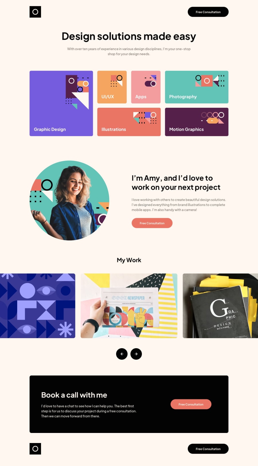
This was the most challenging project I've made. I got frustrated and stuck on coding the photo slider and still don't understand how to create it. It works fine in mobile and desktop mode, but on tablet it doesn't look the way it should (it still slides though).
Would really like someone to give me feedback and help on how to add white space between the photos in the slider in tablet view please! I didn't want to give up, but I am at an impasse!
Community feedback
Please log in to post a comment
Log in with GitHubJoin our Discord community
Join thousands of Frontend Mentor community members taking the challenges, sharing resources, helping each other, and chatting about all things front-end!
Join our Discord
