Submitted about 1 year ago
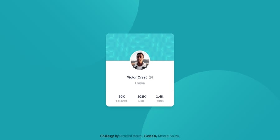
Responsive profile card using taiwind css and flexbox
@M-its
Design comparison
SolutionDesign
Solution retrospective
There is something else I can do to improve accessibility?
Community feedback
- @Mennatallah-HishamPosted about 1 year ago
Hi, you did a good job
Some little tips to improve your code:
- add meta description for better SEO check::https://moz.com/learn/seo/meta-description
- you shouldn't skip heading levels
- use <p> instead of <h3> and <h4>
- you can use labeled-by to define a name/relation between the number and their titles for screen readers
<p class="font-bold text-lg text-very-dark-desaturated-blue" aria-labelledby="title" > 803K </p> <p class="text-[11px] text-dark-grayish-blue tracking-widest" id="title" > Likes </p>
Hope this helps 😉 and Happy coding!
Marked as helpful0
Please log in to post a comment
Log in with GitHubJoin our Discord community
Join thousands of Frontend Mentor community members taking the challenges, sharing resources, helping each other, and chatting about all things front-end!
Join our Discord