Design comparison
Solution retrospective
I learned the concept of using CSS properly. First, I reset all the browser-based CSS, and then I applied my own CSS. I also learned how to create variables in CSS and implement them easily, so that the project maintains consistency. Additionally, I learned how to make things responsive by using rem or em for sizing.
Community feedback
- @SunilParbhooPosted 28 days ago
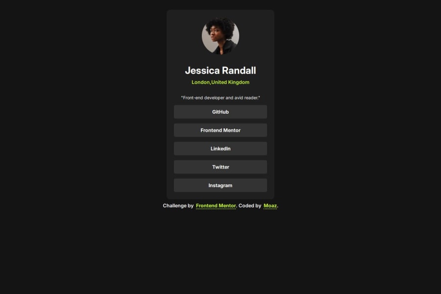
Hello Moaz-shamim, well done on completing this challenge! I noticed that your profile card is aligned vertically closer to the top of the page. Additionally I noticed that you made both the body and the main element display of flex. In order to align the card vertically to more closely align with the design, you could remove the
display:flex(along with the other flex properties on the main element ( flex-direction, justify-content, and align-items), and addmin-height: 100vhto the body element. This should help it better center vertically. Hope this helps, and all the best on your continued coding journey!1@moaz-shamimPosted 28 days ago@SunilParbhoo Thanks Sunil for Your Valuable feedback :)
0
Please log in to post a comment
Log in with GitHubJoin our Discord community
Join thousands of Frontend Mentor community members taking the challenges, sharing resources, helping each other, and chatting about all things front-end!
Join our Discord
