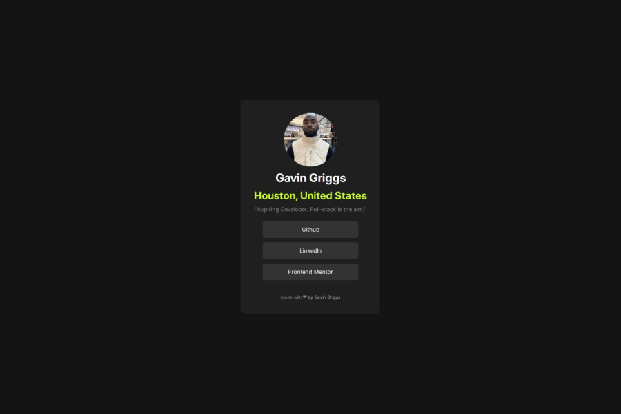
Not Found
Not Found
Not Found
Not Found
Not Found
Not Found
Not Found
Not Found
Not Found
Not Found
Not Found
Not Found
Not Found
Not Found
Not Found
Not Found
Not Found
Not Found
Not Found
Not Found

Submitted

Responsive profile card using Flexbox

@gavndev

Desktop design screenshot for the Social links profile coding challenge

This is a solution for...

  • HTML
  • CSS
1newbie
View challenge

Design comparison


SolutionDesign

Solution retrospective


What are you most proud of, and what would you do differently next time?

One thing I'm most proud of is the animations, I made an attribution section within the profile card and gave the heart a beating animation, as well as giving the headers some light bounce or hover to make them feel as if they are floating in their own space. I did all this only with the knowledge of CSS animations and keyframes.

What I'd do differently is add more buttons and for sure learn media queries. I should've spent some time focusing on the media queries for mobile workflows, but unfortunately I didn't, however, they still look just alright for what I created, and I'm proud of myself still!

What challenges did you encounter, and how did you overcome them?

The challenges I encountered were endless, figuring out how to center the div on the view port, figuring out alignment for content and text, removing the buttons and text decoration for the links, and keyframing the animations. Trust me, there's many things I needed help with and had to look up, but I understood why these things happened and they made my project turn out even better. Looking at documentation truly is the best way to learn anything you struggle with.

What specific areas of your project would you like help with?

The media queries and sizing. I cant quite understand sizing within the box model just yet but I understood it enough to make the project. I'd love to get more advice on media queries and mobile workflows!

Community feedback

MikDra1 6,510

@MikDra1

Posted

If you want to make your card responsive with ease you can use this technique:

.card {
width: 90%;
max-width: 37.5rem;
}

On the smaller screens card will be 90% of the parent (here body), but as soon as the card will be 37.5rem (600px) it will lock with this size.

Also to put the card in the center I advise you to use this code snippet:

.container {
display: grid;
place-items: center;
}

Hope you found this comment helpful 💗💗💗

Good job and keep going 😁😊😉

Marked as helpful

1

@gavndev

Posted

YES! Thank you for the lovely comment but even more thanks for the feed back! I looked everywhere to see how to “properly center the main card, I wasn’t sure what I was missing but ended up finding the flex children in a flex item with “justify content” “align items” worked out temporarily. But I really appreciate the help and I’d love to push your idea to the actual code :)

And double thanks for the media queries!! I wanted to get them down but couldn’t figure out how they worked. Best of love! 💕 @MikDra1

0
P
Steven Stroud 7,620

@Stroudy

Posted

Amazing job with this! You’re making fantastic progress. Here are some small tweaks that might take your solution to the next level…

  • Using a <main> tag inside the <body> of your HTML is a best practice because it clearly identifies the main content of your page. This helps with accessibility and improves how search engines understand your content.

  • Your heading elements <h1><h3>, Heading elements should be in sequentially-descending order (e.g., <h1>, <h2>, <h3>) to create a clear content structure, improving accessibility and SEO. Skipping levels or using them out of order can confuse screen readers, affect search engine rankings, and make your content harder to understand.

  • Using a full modern CSS reset is beneficial because it removes default browser styling, creating a consistent starting point for your design across all browsers. It helps avoid unexpected layout issues and makes your styles more predictable, ensuring a uniform appearance on different devices and platforms, check out this site for a Full modern reset

  • I think you can benefit from using a naming convention like BEM (Block, Element, Modifier) is beneficial because it makes your CSS more organized, readable, and easier to maintain. BEM helps you clearly understand the purpose of each class, avoid naming conflicts, and create reusable components, leading to a more scalable codebase. For more details BEM,

  • For future project, You could download and host your own fonts using @font-face improves website performance by reducing external requests, provides more control over font usage, ensures consistency across browsers, enhances offline availability, and avoids potential issues if third-party font services become unavailable. Place to get .woff2 fonts

You’re doing fantastic! I hope these tips help you as you continue your coding journey. Stay curious and keep experimenting—every challenge is an opportunity to learn. Have fun, and keep coding with confidence! 🌟

0

Please log in to post a comment

Log in with GitHub
Discord logo

Join our Discord community

Join thousands of Frontend Mentor community members taking the challenges, sharing resources, helping each other, and chatting about all things front-end!

Join our Discord