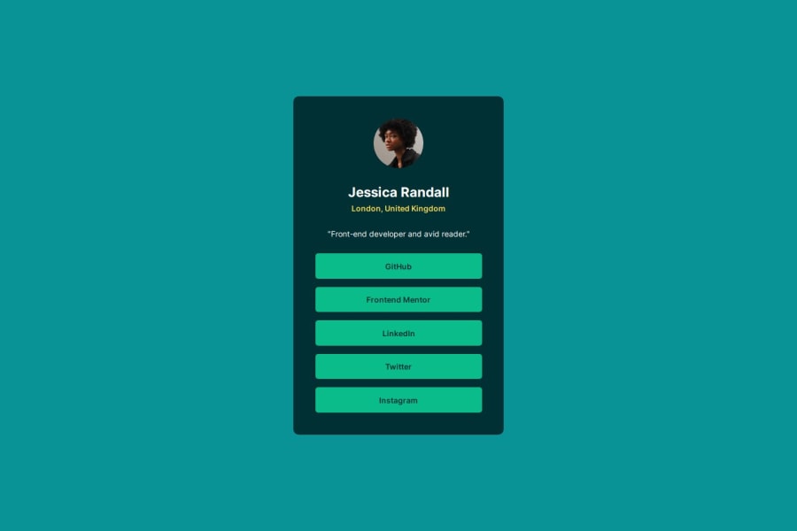


Design comparison

Solution retrospective
I was able to load local static fonts using @font-face property
What challenges did you encounter, and how did you overcome them?- Had difficulty in measuring the spacing in design files without Figma files. Used Chrome extensions 'Dimensions' and 'PerfectPixel' to get the measurements, still it took a lot of trial and error to get the look as close as possible
- Found another resource to compute
clamp()function values
- I changed background & text colors as I didn't like the colors in design file. I hope the color contrast is acceptable
- I'm still not sure that I'm naming the classes and custom properties right way. I appreciate if anybody could help me with that
- I used
clamp()for changing padding. Is this function can also be used for spacing in addition to change font-size?
Community feedback
- @LucieLuBPosted 7 months ago
Feedback on CSS:
1- Font Management:
Using @font-face to load custom fonts is a good practice, and you're loading different weights, which is great for flexibility. However, consider using a font-display property (e.g., font-display: swap;) to enhance performance by showing fallback fonts while custom fonts are being loaded.
2- Variables (:root):
Color Variables: You’ve defined a well-organized and clear set of color variables. It’s great that you’ve separated them into background and text colors.
Typography Variables: Defining font sizes and weights as variables improves maintainability and scalability. One suggestion: use rem units consistently for better responsiveness (e.g., --font-size-name: 1.5rem; is good).
Spacing Variables: Your usage of clamp() for dynamic spacing and sizing is excellent, as it provides responsive flexibility across different screen sizes.
3- Global Reset:
The use of a global reset and box-sizing: border-box; is a good practice to standardize padding and margin behavior across browsers.
You may want to consider adding line-height: inherit; to the reset for a more predictable line-height inheritance.
4- Responsive Typography:
It’s good that you use rem and clamp() for scaling text and elements, ensuring your design is responsive. However, you might want to define more media queries if further fine-tuning is needed on different screen sizes.
5-Accessibility:
The use of .sr-only for visually hidden elements is a great accessibility practice, especially for screen readers. Make sure interactive elements like the social media links are fully accessible (e.g., by ensuring good color contrast and focus states).
6-Hover and Focus States:
The hover and focus states are well-defined. You've added color and background changes for interactivity, which enhances user experience. Consider adding a more visible focus outline (instead of just removing it) for better keyboard accessibility.
7- Box Shadows:
You’ve included a custom box shadow on hover (--box-shadow-hover). This adds depth to interactive elements, which is a nice touch.
8- Social Media Links (.social__link):
The button-like styling of the links (display: block, padding, background-color) works well for mobile and desktop environments. Ensure that color contrast ratios between text and background colors meet accessibility standards, especially in the hover and active states.
Feedback on HTML:
1-HTML Semantics:
The structure of the HTML is clean, well-organized, and follows good semantic practices (e.g., header, main, h1, h2). Visually Hidden Heading: The h1 with the .sr-only class is a good practice for screen readers, helping with accessibility without affecting the visual layout.
2- Profile Section:
The structure of the profile section is clear and concise. The use of a blockquote tag for the quote adds semantic value. Consider adding a <figcaption> for images if more context is needed (e.g., profile pictures).
3- Social Media Links:
The ul element for social media links is semantically correct. Each li represents a list item, and the links themselves are appropriately structured. Ensure the href attributes in the anchor tags (<a>) point to valid URLs. They currently contain empty href="#", which should be replaced with real links or href="javascript:void(0)" if no action is expected.
4- Use of Alt Attributes:
You’ve added a descriptive alt attribute for the profile image, which is excellent for accessibility. Ensure all other images (if added later) also have meaningful alt attributes.
General Recommendations:
Performance: Use font-display: swap; in your @font-face rules to improve loading performance and avoid invisible text during font loading.
Accessibility: Consider enhancing focus styles for better keyboard navigation (e.g., more visible outlines or shadows). Ensure color contrast is sufficient, especially for links in different states (hover, focus, active).
Responsiveness: You’re already using clamp() and rem, which is great for responsiveness. You may want to test your layout on various screen sizes to ensure everything scales smoothly. Consider adding media queries for more control over breakpoints if needed.
Consistency: Ensure consistency in the use of units (rem, px, em). For example, you're using rem for text sizes but px for some padding. Stick to rem for padding and margins to ensure scalable design.
Overall, the code is clean, well-structured, and shows great attention to detail with accessibility and responsiveness in mind!
Marked as helpful0

Please log in to post a comment
Log in with GitHub
Join our Discord community
Join thousands of Frontend Mentor community members taking the challenges, sharing resources, helping each other, and chatting about all things front-end!
Join our Discord