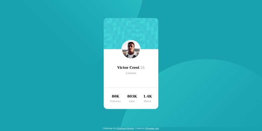
Design comparison
Solution retrospective
-
The most difficult part for me was to adjust two background images "bg-pattern-bottom.svg" and "bg-pattern-top.svg". Initially I tried with "position:absolute", but in the final version, I used "background-position" property with unit percentage. I am still not satisfied with this implementation. I would like to know more sophisticated way to implement this feature.
-
Also the designs are created for below widths: Mobile: 375px Desktop: 1440px So, I have created one media query for min-width:1440px . Want to know if it's a correct approach
Community feedback
- @sirriahPosted about 4 years ago
Hello,
I saw your code, and I think, that it is pretty cool. I used similar solution for background circles like you.
- I recommend to use the BEM naming.
- I see that you are using px units for fonts etc. Maybe try to use rem instead. See this super video tutorial.
I look forward do your next design. Happy coding!
0@priyankaladPosted about 4 years ago@sirriah I refer the code of the user @analuzcervantes. She has used below background position style to adjust those 2 images and I found it very useful
body{ //other styles... background-position: right 45vw bottom 45vh, left 45vw top 45vh; }
I hope, you find it useful too :)
1
Please log in to post a comment
Log in with GitHubJoin our Discord community
Join thousands of Frontend Mentor community members taking the challenges, sharing resources, helping each other, and chatting about all things front-end!
Join our Discord
