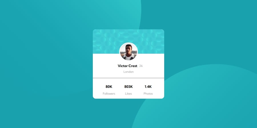
Design comparison
SolutionDesign
Solution retrospective
What are you most proud of, and what would you do differently next time?
I’m proud of pretty much everything; this is one of my first projects ever.
What challenges did you encounter, and how did you overcome them?I encountered a challenge with width and height, but I managed to kinda solve it after a lot of trials and errors.
What specific areas of your project would you like help with?I would like help with width and height, as well as font size.
Community feedback
Please log in to post a comment
Log in with GitHubJoin our Discord community
Join thousands of Frontend Mentor community members taking the challenges, sharing resources, helping each other, and chatting about all things front-end!
Join our Discord
