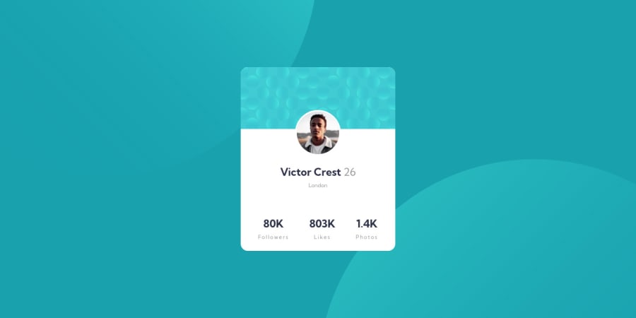
Design comparison
Solution retrospective
Hello everybody. Here is my solution for profile card component. I've got some issues on background section. I'm open to advices for it. Thank you ! :)
Community feedback
- @Mansour0007Posted almost 3 years ago
Hello Ekrem Good job Try using background positioning background-image: url(/images/bg-pattern-top.svg), url(/images/bg-pattern-bottom.svg); background-repeat: no-repeat; background-position: right 52vw bottom 35vh, left 48vw top 52vh;
Good luck
Marked as helpful1@ekremilkanPosted almost 3 years ago@Mansour0007 Thank you Mansour. I tried and it worked. Thanks for the help.
1 - @rsrclabPosted almost 3 years ago
Hi, @ekremilkan ~
Congratulate on your solution to the challenge on FM platform. I have studied your work carefully and learned a lot from it. I think your solution to background is wonderful.
Here are some of the tips I like to provide. I suggest you to try BEM for classing elements. It will help you on bigger projects.
https://www.frontendmentor.io/solutions/profile-card-solution-m-cH4D2Lp
Here is my solution to this challenge, and if it can help you even a bit, it would be happy to me.
Cheers ~
Marked as helpful1@ekremilkanPosted almost 3 years ago@tymren608 Thank you so much for suggest. Your solution helped me a lot.
0
Please log in to post a comment
Log in with GitHubJoin our Discord community
Join thousands of Frontend Mentor community members taking the challenges, sharing resources, helping each other, and chatting about all things front-end!
Join our Discord
